Key Takeaways
RGB and CMYK are different color models used for digital screens and printed materials, and choosing the correct one helps avoid unexpected color shifts in print.
- RGB is for screens. This includes websites, apps, social media, and photography.
- CMYK is for print, such as business cards, brochures, posters, and packaging.
- RGB files sent to a printer can cause unexpected color shifts.
- Designing in CMYK from the start sets more realistic expectations for print.
- For dual-use projects, design in CMYK and export an RGB version for digital.
Color does more than make things look nice. It shapes how people feel, what they notice, and whether they trust what they're looking at.
But even the most carefully chosen palette can go sideways if you're working in the wrong color mode.
If you've ever sent a file to a printer and wondered why it came back looking dull and flat compared to your screen. This is why.
RGB and CMYK are two fundamentally different ways of producing color, and mixing them up is one of the most common (and preventable) mistakes in design.
Here's what you need to know.
What is the Difference Between RGB and CMYK
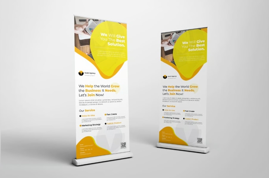
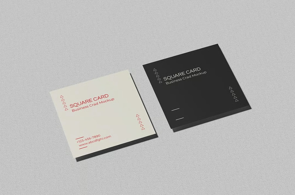
When designing for a computer screen, you use RGB colors. But you'll need to use CMYK colors if you’re making something to be printed, like business cards, posters, or a magazine.
Knowing the difference between RGB vs CMYK is helpful.
The difference between color modes is more than a fun fact; not knowing the difference can make or break your graphic design project.
What is RGB?
RGB stands for red, green, and blue. It's an additive color model. This means color is created by combining light.
Every screen you interact with, from your phone to a billboard, renders images using tiny red, green, and blue subpixels. By varying the intensity of each, a screen can produce over 16 million distinct colors.
In RGB, each channel has a value from 0 to 255. Zero means no light; 255 means full brightness. Here's how that plays out for the most basic colors
- Black = R:0 G:0 B:0
- White = R:255 G: 255 B: 255
- Red = R:255 G:0 B:0
Any image captured by a digital camera is stored in RGB. So is any file you're designing for a website, app, or social media.
If it lives on a screen, it should be in RGB.
Best File Formats for RGB
- JPEG: Best for photos. Balances quality and file size well.
- PNG: Better for graphics, icons, or anything needing a transparent background.
- WebP: Modern format that handles both photos and graphics with smaller file sizes.
- PSD: Adobe Photoshop's native format; ideal for layered editing work
What is CMYK?
CMYK stands for cyan, magenta, yellow, and black (the K stands for "key," referring to the key printing plate in traditional lithography).
Unlike RGB, CMYK is a subtractive model; inks absorb certain wavelengths of light and reflect others. The more ink you add, the darker the result.
CMYK values are expressed as percentages. A business card, magazine, or brochure designed for professional printing should be in CMYK mode so the colors match what the printer actually produces.
Here's what you need to know about CMYK and black: mixing 100% cyan, magenta, and yellow together produces a muddy dark brown, not true black.
That's why black (K) exists as its own channel. And for the deepest possible black in print, designers often use what's called "rich black":
- Standard Black = C:0% M:0% Y:0% K:100%
- Rich Black = C:75% M:68% Y:67% K:90%
- White = C:0% M:0% Y:0% K:0%
Worth Knowing: Ever saved a photo to print and thought, "That blue looked so much brighter on my phone"? That's not a printer error, it's just physics. Screens glow with light; ink doesn't. Some colors that look electric on a display, especially vivid blues, greens, and neons, simply don't exist in the ink world. Designing in CMYK from the start means you see those limitations early, while you can still do something about them.
Best File Formats for CYMK
- PDF: The standard for sending files to a print shop. Embeds color profiles and preserves layout.
- AI: Adobe Illustrator's native format. Best for vector-based work like logos and layouts.
- EPS: Older but widely compatible with other vector programs. Still used for logos and print graphics.
- PSD: Photoshop supports CMYK, useful when editing photographs intended for print.
Before Submitting Files: Ask your print company which file format and color profile they prefer. Many have specific requirements that override general best practices.
RGB vs. CMYK at a Glance
RGB
- Medium: Screens and digital displays
- Model: Additive (light)
- Gamut: Very wide — 16.7M+ colors
- Use for: Websites, apps, social media, video, photography
CMYK
- Medium: Physical printed materials
- Model: Subtractive (ink)
- Gamut: Narrower, optimized for ink on paper
- Use for: Business cards, brochures, posters, packaging, magazines
Converting Between RGB and CMYK
Starting in the right mode is ideal, but conversions are sometimes unavoidable. Most professional design tools handle this reasonably well:
- Adobe Photoshop and Illustrator both have built-in color mode conversion under the Image or File menus. The conversion is automatic, but some color shift is expected.
- Color profiles (like Adobe RGB or sRGB for screens, or FOGRA39 for European print standards) tell software how to interpret and translate color data. Using the right profile reduces drift.
- Soft proofing in Photoshop or Illustrator lets you simulate how your design will look when printed, before you commit to a print run.
When Your Design Needs to Work in Print and Digital
If you're converting a file with saturated blues or vivid greens, expect some loss — these are particularly difficult to reproduce in CMYK. Soft proofing early helps you make adjustments while it's still easy.
If a design will live in both digital and print contexts, say, a brand identity system, the cleanest approach is to design in CMYK and export an RGB version for screen use.
This way the print version (which has the tighter gamut) stays accurate, and the digital version can be brightened slightly if needed.
You don't need to memorize every technical detail here. But knowing which mode your project needs, and checking before you start, is one of the easiest ways to avoid rework downstream.
The Bottom Line: Just Check Before You Start
Color is one of the first things people notice and one of the last things designers think to double-check. You can spend hours perfecting a layout, agonizing over shades, and getting everything just right. Then lose it all to a simple mode mismatch.
RGB or CMYK. Screen or print. It's a two-second check that can save you a reprint, a deadline, and a headache. Now you know which one you need.
RGB and CMYK Frequently Asked Questions
High-quality PDF, TIFF, or EPS files are preferred, preferably with CMYK color settings already applied.
No, use RGB for anything digital (social media, websites) to maintain vibrancy.
CMYK is the safer starting point. It works across both print and digital, and you can always export an RGB version for screens. Going the other direction — from RGB to CMYK — sometimes means losing color detail you can't recover.
Screens emit light (RGB), while printed materials reflect it (CMYK). The two mediums render color differently by nature, and CMYK has a narrower gamut — some vivid screen colors simply can't be fully reproduced with ink.
It depends on where your design is going. RGB is for screens: websites, social media, digital ads. CMYK is for print: business cards, flyers, and packaging. If your project lives in both worlds, design in CMYK first and export an RGB version for digital.
Most printers will either reject it or auto-convert it, and that conversion can cause noticeable color shifts, especially with bright blues, greens, and reds. You may not realize it until the job is already printed.
You can convert it, but some color shift is normal and expected. Soft proofing in Photoshop or Illustrator before sending to print helps you catch and correct anything noticeable while you still can.