
Key Takeaways
The file format you choose has a direct effect on how sharp and accurate your printed materials look.
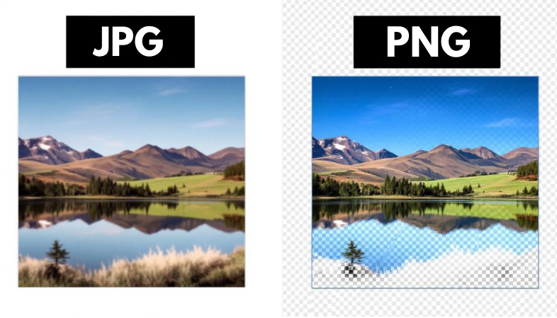
- JPG works best for photos. It handles full color images and smooth gradients well, but its compression drops a little detail each time the file is saved.
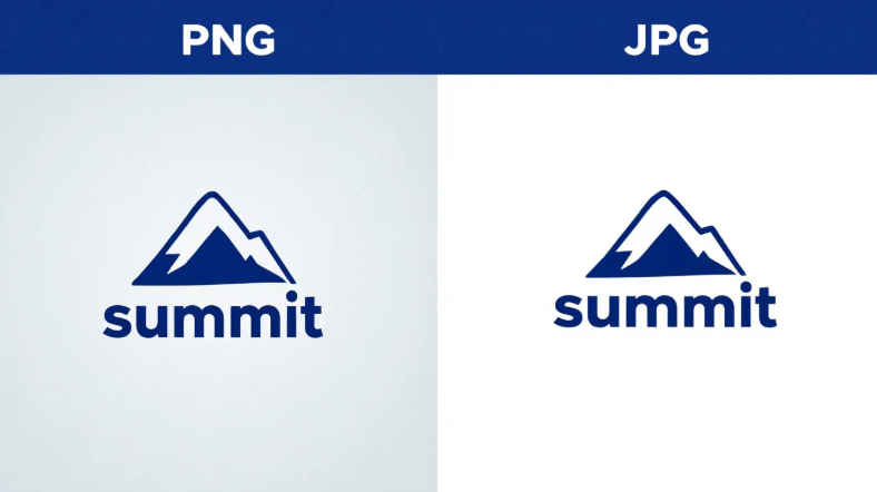
- PNG works best for logos and graphics. It keeps every detail through lossless compression and supports transparent backgrounds, which is why logos, icons, and text stay clean.
- Resolution matters as much as format. A file set below 300 DPI prints blurry no matter which format you pick.
- The wrong format causes real problems. Low resolution files, compression artifacts, and unconverted RGB color all show up in the final print.
- Match the format to the job. Knowing when to use JPG versus PNG cuts down on reprints and production delays.
The image file you upload directly affects how your printed piece turns out. Upload a photo for a poster, a logo for business cards, or artwork for custom notepads, and the file type decides how sharp and detailed it looks once it comes off the press.
JPG and PNG are the two formats you will run into most. They can look identical on screen and still print very differently.
Knowing how each one handles compression, color, and detail helps you avoid blurry results and pick the right format the first time.
What is a JPG?
A JPG, also written as JPEG, is one of the most common image formats for photos and full color designs.
It keeps file sizes small by using lossy compression, which drops a small amount of image data every time the file is saved or re-compressed.
In a standard photo you usually will not notice the loss. On designs with thin lines, small text, or sharp logo edges, the missing detail starts to show once the piece is printed.
JPGs are fast and easy to work with, but they are not always precise enough for high detail print work.
What is a PNG?
A PNG, short for Portable Network Graphics, holds up well for print projects that need sharpness and clean detail.
Unlike JPGs, PNGs use lossless compression, so the image stays clear no matter how many times it is saved or edited.
That makes PNG a strong fit for print materials with logos, text, or detailed graphics where clean edges matter.
It also supports transparent backgrounds, so you can place a design over different colors or textures without a white box around it.
PNG files are usually larger than JPGs, and that extra data is what keeps the image sharp in print. For branding elements, fine lines, or type that needs to stay crisp on paper, PNG is the safer pick.
Key Differences Between: JPG and PNG Files
Before you print a photo or a design, it helps to know where these two formats split. Here is what to keep in mind:
- Compression. JPGs use lossy compression, which trims image data to keep files small and can soften pixels. PNGs use lossless compression, so they hold every detail but take up more space.
- Transparency. PNGs support transparent backgrounds, which is what lets a logo layer cleanly over other elements. JPGs cannot do this.
- File size. JPGs are smaller and easier to share. PNGs are larger but keep more detail, which matters when sharpness counts.
- Quality and detail. PNGs are best for text, sharp edges, and logos. JPGs are better for full color photos where a small amount of quality loss will not be noticed
When to Use JPG for Printing
JPG is a strong choice for colorful, photo heavy designs that need manageable file sizes. It holds rich colors and smooth gradients well, which makes it a good fit for photography, lifestyle imagery, and product shots.
It is also the standard for online stores and web visuals, where quality and fast load times both matter.
Because JPG compresses the file, it keeps large images easy to handle when a slight drop in detail will not be noticed. It also opens in nearly every design and editing program, so adjustments are quick.
For everyday print materials like flyers, posters, and marketing pieces built around photos rather than fine text or logos, JPG gets the job done.
When to Use PNG for Printing
PNG is the better choice for print designs that need sharp detail, clean edges, or transparent backgrounds. It is a good fit for logos, icons, and text based graphics where clarity matters most.
The lossless compression keeps every bit of image data, so visuals stay crisp even after multiple saves or edits.
For business cards, branded stationery, and marketing pieces with detailed line work or typography, PNG keeps the finish clean and professional.
It also handles designs that need to sit over different backgrounds without leaving a border or color block behind. The larger file size is the tradeoff, and for detail driven print work it is worth it.
Common Mistakes to Avoid
Small file choices can change how the final print turns out. Here are the print errors that come up most often:
Uploading Low-resolution JPGs
An image that looks sharp on screen can print blurry or pixelated when the file does not have enough pixels for the print size.
A 72 DPI image pulled from a website may look fine online but fall apart on a printed brochure or postcard.
Most screens display at only 72 to 96 DPI, while the commercial print standard is 300 DPI, a level set in part by the ISO 12647-2 offset printing standard. Aim for at least 300 DPI at the final print size.
Using PNG files for Photo-Heavy Designs
PNG is great for graphics with transparency like logos or icons, but it is not built for full color photos. Because it compresses less than JPG, the file gets large without looking any better.
Saving a photo based flyer as a PNG just makes the file harder to handle. A high quality JPG keeps the design crisp and easy to work with.
Forgetting to Convert RGB to CMYK
Screens display color in RGB, while printers use CMYK. Some formats, including PNG, do not support CMYK, and CMYK is what gives you accurate print color.
Leaving a file in RGB can make colors print dull or slightly off. A bright turquoise on screen might come out closer to teal on paper. Convert your artwork to CMYK before sending it to print for results that match what you see.
Tips for Selecting the Right Format
The right format makes a real difference in the final print. Here is how to choose for your project:
Assess the Type of Design
Start with what the design is made of. If it is photo heavy, like a travel poster, real estate flyer, event brochure, or product shots for an online store, JPG handles the gradients and rich colors well.
If it is text or graphic focused, like a logo, infographic, or signage with sharp lines, a PNG or PDF keeps the edges clean.
Balance File Size and Quality
A bigger file does not always print better. A massive PNG of a full-page photo can slow your upload without improving the result, while a smaller high resolution JPG prints well and is easier to manage.
Formats that hold more data are easier to edit later, so weigh clarity against practicality, especially for high volume jobs like menus or postcards.
Ask Your Printing Provider
Each printer has its own preferred formats and specs. Some ask for a TIFF file for uncompressed, high quality output, or a PSD file to keep layers and editing options open.
If you are not sure whether to send a JPG, PDF, PNG, TIFF, or PSD, ask before you upload. A quick check helps you avoid color shifts, sizing errors, and low quality prints, and it keeps the final product looking the way you planned.
The Bottom Line
Choosing between JPG and PNG really comes down to what your design needs. Photos and full color images usually shine best as JPGs, while graphics, text, and logos often print cleaner as PNGs or PDFs. Before uploading, take a moment to double check your file format.
It's a simple step that helps avoid blurry prints or color surprises later. And when you’re ready to bring your design to life, upload your files with Print Cartel.
We’ll make sure your images print beautifully, just the way you envisioned.
Frequently Asked Questions About JPG and PNG Files for Printing
Is JPG or PNG Better for Printing?
It depends on the design. JPG is better for full color photos because it handles gradients well at smaller file sizes. PNG is better for logos, text, and graphics with sharp edges or transparent backgrounds, since its lossless compression keeps every detail.
What DPI Should an Image Be for Printing?
Print files should be 300 DPI at the final print size, which is the commercial print standard. Images pulled from a website are often only 72 to 96 DPI, which looks fine on screen but prints blurry.
Can You Print a PNG File?
Yes. PNG files print well for logos, icons, and text based graphics where clean edges matter. They are not the best pick for photo heavy designs, since the larger file size adds no quality benefit over a high resolution JPG.
Why Does My Image Look Blurry After Printing?
The most common cause is low resolution. A file that looks sharp on screen may not have enough pixels to hold up at print size. Set files to 300 DPI at the final size and convert color to CMYK before sending to print.