
Key Takeaways
Typesetting plays a major role in how your audience reads, understands, and perceives printed designs.
- Typesetting arranges text for clarity and balance in print design.
- Good typesetting improves readability and strengthens your brand.
- Key elements include fonts, spacing, hierarchy, margins, and alignment.
- Clean typesetting makes business cards, postcards, and brochures more effective.
- Avoid common mistakes like overcrowding, tight kerning, or inconsistent spacing.
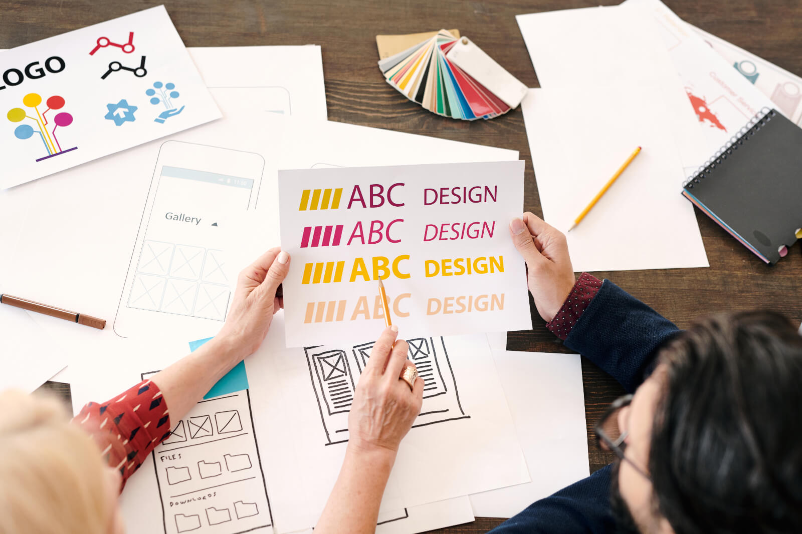
If you’ve ever designed a business card, postcard, or flyer and felt something looked slightly off, even with strong colors and great photos, the issue is often typesetting. Poor text layout can make print materials feel unpolished, cluttered, or difficult to read.
Typesetting is more approachable than it sounds, and once you understand it, your print pieces look more refined and professional, greatly enhancing the reading experience.
What Typesetting Means in Print Design
Typesetting is the structured placement of text on a page so your message is easy to read and visually consistent.
It covers decisions such as:
- Font selection
- Text size and scale
- Line spacing (leading)
- Letter spacing (kerning)
- Word spacing (tracking)
- Alignment
- Margins and safe zones
- Hierarchy between headings and body text
Every piece of printed communication, menus, business cards, brochures, table tents, and other marketing materials relies on thoughtful text layout to feel clear, professional, and reflective of your brand identity.
Think of it like organizing your workspace. When everything is arranged with purpose, the experience is smooth. Typesetting does the same for printed design.
Why Typesetting Matters
Whether you’re creating business cards, mailers, menus, large format posters, or working on publishing projects, typesetting plays a major role in how your message is received. Even the most beautiful design can feel cluttered or confusing if the text isn’t handled well due to poor formatting.
Poor typesetting can undermine the professionalism and readability of publishing projects, making the content difficult to follow and less appealing to readers.
Here are the core reasons typesetting is so important:
1. Readability
Readable text is the starting point for any print piece. Small adjustments in leading, spacing, or alignment can dramatically change how comfortable a design is to read, especially on small formats like business cards, starting from the first line.
If someone can’t quickly find your name, contact details, or call to action, the design loses impact.
A helpful guideline: readability improves when line spacing is set between 120–145% of the font size.
2. Visual Hierarchy
Hierarchy guides the reader’s eye in the order you intend.
Examples:
- On a business card, your name should be more prominent than your website.
- On a postcard design, or door hanger design, the headline should capture attention before the offer.
- On a flyer, the call to action should be unmistakable and easy to spot.
Good hierarchy helps the viewer move naturally from one detail to the next without hesitating or searching.
3. Aesthetics and Brand Personality
Every font, spacing choice, and alignment decision communicates something about your brand.
- A serif font feels refined and traditional
- A clean sans serif suggests modern simplicity
- Rounded fonts give a friendly tone
Consistent typesetting across all printed materials reinforces your brand identity and makes your design feel intentional.
Core Elements Designers Adjust
You don’t need to be a professional designer to understand the basics.
Here’s a quick breakdown of typesetting examples, the foundational components that affect how text looks in print:
Font Selection
Serif, sans serif, or decorative, your choice influences tone and readability. Clean, simple fonts are usually best for small print details.
Text Size and Scale
Small formats often require larger or more open text to maintain readability. Brochures and menus, with their increased space, allow for more variation in scale and contrast, while larger pieces offer even greater flexibility to play with text size and visual hierarchy.
Adjusting these elements thoughtfully ensures that your message remains clear and engaging across the entire page , no matter the format.
Leading (Line Spacing)
Leading is the vertical space between lines. Too tight feels crowded; too loose feels disconnected.
Kerning, Tracking, and Word Spacing
- Kerning adjusts spacing between individual letter pairs
- Tracking adjusts spacing across full words or lines
Both help prevent awkward gaps, overly tight clusters, or repeated line starts. Even small adjustments can drastically improve how names, headlines, and product titles look in print.
Alignment
Left-aligned is typically easiest to read. Centered works for short highlights, such as names on business cards. Right-aligned can be stylish, but harder to read if overused.
Margins, Bleed, and Safe Zones
These prevent important text from being trimmed. Business cards and postcards depend heavily on correct edge spacing.
How Typesetting Affects Different Print Materials
Before putting these principles into practice, it helps to see how typesetting influences the look and readability of different printed pieces.
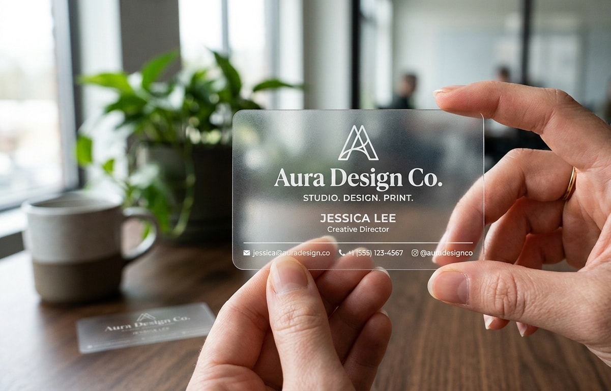
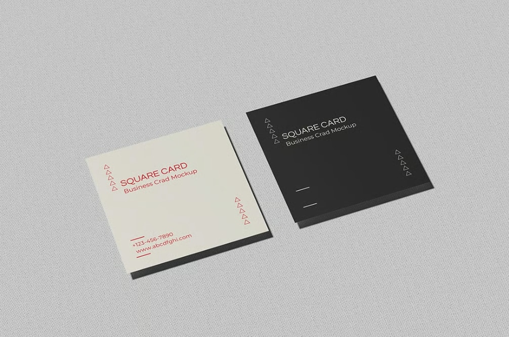
Business Cards
The limited space highlights the importance of clean hierarchy, adequate spacing, and proper margins. Even one poorly spaced line can make the card feel cramped.
Postcards
With more room available, hierarchy becomes essential. Headline → message → call to action should be clearly separated with spacing or breaks.
Flyers, Menus, and Brochures
Typesetting organizes dense information into sections that are easy to skim. Thoughtful spacing and structured text blocks increase readability and help guide the reader.
Typesetting vs Layout: What’s the Difference?
Design layout and typesetting work together, but they serve different purposes in print design.
Layout refers to the placement of all visual elements on a page, including images, graphics, and overall composition. It shapes the full page structure and creates visual balance across the design.
Typesetting, on the other hand, deals specifically with how text is arranged. This includes spacing, alignment, hierarchy, and readability. Strong typesetting improves clarity and ensures your message is easy to understand.
In simple terms:
- Layout organizes the visual framework.
- Typesetting organizes the text within that framework.
Understanding the distinction helps you refine both parts of your design and produce print materials that look polished and read smoothly.
The Creative Side of Typesetting
Technical precision creates the foundation, but creativity adds personality.
Strong creative choices include:
- Strategic white space to prevent clutter
- Font size variations to emphasize hierarchy
- Subtle bold or italic accents
- Adjusting spacing around names or small details
- Intentional alignment choices to create movement or stability
Even minor refinements can make postcards, business cards, and brochures feel more polished and memorable.
Common Typesetting Mistakes (and How to Avoid Them)
Many design issues stem from a few avoidable errors:
- Using too many fonts
- Text placed too close to the edge
- Tight or uneven kerning
- Centering all text
- Overcrowding the layout
- Poor color contrast
- Readability issues on small items
- Orphaned headings at the bottom of a page
- Inconsistent formatting across brochure or booklet spreads
These problems are easy to correct once you know what to look for.
Final Thoughts
Typesetting might sound technical, but at its core, it’s simply the art of making text look good, and making sure your message is understood. Once you notice how type affects readability and design, it becomes one of the most valuable tools in creating print materials that feel polished and professional.
Frequently Asked Questions About Typesetting
What is typesetting in print design?
Typesetting is the process of arranging text fonts, spacing, alignment, and hierarchy so printed materials are clear, readable, and visually balanced.
How does typesetting improve the look of print materials?
Proper spacing and hierarchy help guide the eye, reduce clutter, and give the design a polished, professional appearance.
How do hierarchy and alignment help guide the reader?
Hierarchy organizes text from most to least important, while alignment creates consistent structure that helps the viewer navigate the page without confusion.
How does typesetting relate to brand identity?
Consistent font use, spacing, and structure across postcards, brochures, and business cards create a unified brand experience and communicate professionalism.