
Key Takeaways
Color trends in print design help brands stay current while shaping how customers feel and respond to printed materials.
- Color choices influence mood, perception, and emotional response before any message is read.
- Print-specific color trends often differ from digital trends due to ink, paper, and finish considerations.
- Using trend-inspired colors thoughtfully can refresh a brand without losing consistency or recognition.
- Paper type and print finishes can change how colors appear, making test prints an important step.
- Balancing timeless brand colors with trend-driven accents helps designs feel current while remaining professional.
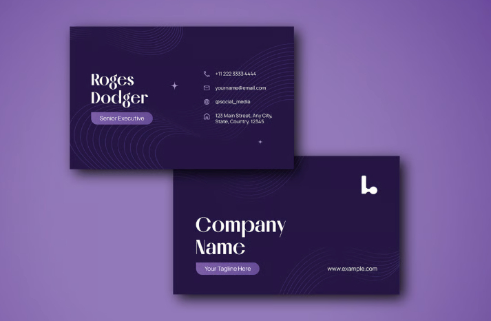
Color sets the mood long before someone reads a single word on your business card, postcard, or menu. For 2026, designers are leaning into a mix of soft pastels, bold accents, nostalgic tones, and warm glowing shades, palettes that feel fresh, inviting, and easy to use across print.
If you're refreshing your brand or planning new print materials, these trends will guide you toward colors that feel current, memorable, and meaningful to the people who receive them.
Nature Inspired Greens and Versatile Neutrals
Forecasts for 2026 reveal a strong return to grounded, nature driven colors paired with warm, versatile neutrals. These tones reflect calm, balance, and visual harmony, perfect for brands that want to feel modern, trustworthy, and connected to the world around them. For print materials like postcards, business cards, menus, and brand collateral, these shades offer a refreshing balance of sophistication and approachability.
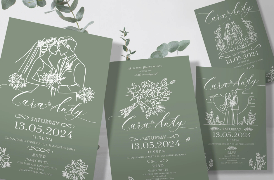
Earthy Sage
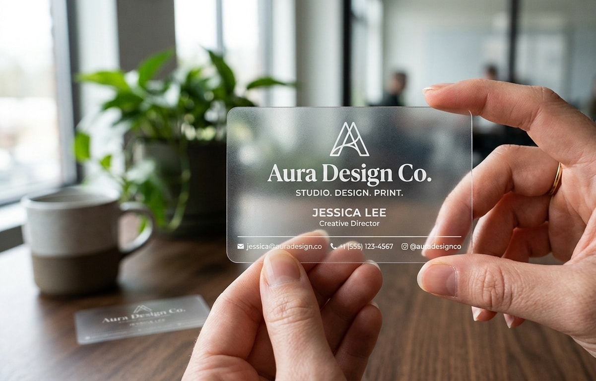
A muted, calming green with grey undertones. Earthy Sage brings tranquility and understated elegance to business cards, stationery, or luxury packaging. It pairs beautifully with white, gold foil, charcoal, or soft taupe.
Transformative Teal
A rich blend of blue and green, this color represents clarity, evolution, and fresh energy. It’s bold without being overwhelming, great for modern brands, wellness-based companies, tech-forward designs, and standout accents on marketing materials.
Universal Khaki
A warm, earthy neutral that sits comfortably between beige and soft olive. Universal Khaki is incredibly versatile and works well as a base color for backgrounds, packaging, and minimalist branding. It adds subtle sophistication without stealing attention from your core message.
Walnut Retro Chocolate Brown
Walnut Retro taps into warm browns, earthy oranges, and vintage inspired tones. It carries a nostalgic feel that connects well with brands rooted in craftsmanship, local goods, sustainability, or heritage. Earthy tones like terracotta, olive green, and burnt orange create a warm, cozy, and grounding atmosphere, making this palette especially appealing for businesses that value authenticity and tradition.
Print pieces using walnut tones feel grounded and authentic. They work especially well on textured or uncoated card stocks that add to the old-school charm. Complementing these shades with cream, tan, or bronze foil brings a cozy and familiar mood to the design.
This palette is perfect for small businesses, artisanal shops, lifestyle brands, and restaurants wanting a timeless look.
Soft Moss
A gentle, down-to-earth green with a natural, organic feel. Soft Moss is ideal for brands wanting authenticity and a close-to-nature aesthetic. It works especially well in textured prints, kraft style paper, or paired with botanical illustrations.
Warm Clay Neutral
A sun warmed, terracotta inspired neutral with hints of orange and brown. Warm Clay Neutral feels grounded and artisanal, perfect for lifestyle brands, handmade product labels, restaurant print menus, and postcards with a rustic or creative edge.
These colors are ideal for brands prioritizing calm, trust, and stability, as they pair well with premium finishes, such as Spot UV, Matte, and Gold foils, making them excellent for business cards, stationery, and postcards.
Soft Pastels and Human Centered Tones
Soft, welcoming tones continue to rise in 2026, bringing a warm, approachable personality to print and branding. These colors feel human, comforting, and expressive, perfect for businesses that want to create connection, highlight creativity, or soften their brand presence. Ideal across postcards, business cards, menu designs, packaging, and lifestyle brands.
Banana Yellow
Banana Yellow is a soft pastel yellow that feels warm, friendly, and easy on the eyes. It brings brightness without overpowering the design, making it a natural fit for approachable brands, summer themes, children’s services, and any print piece meant to feel cheerful and uplifting.
This shade works well across postcards, loyalty cards, menus, and small branding items. It pairs cleanly with charcoal or deep grey text for clear readability, and it looks especially modern on matte card stock.
Banana Yellow also excels as an accent. Simple touches icons, borders, or callout elements, add a gentle pop of optimism that lifts the overall design without taking over the layout.
Sunwashed Apricot
Sunwashed Apricot is a warm, peach-orange shade softened by a gentle, sunlit finish. It brings a friendly, positive feel to print designs, making it a strong choice for lifestyle brands, cafés, beauty services, health-focused businesses, and event postcards that need a soft yet upbeat touch.
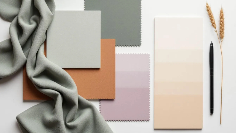
This color sits within the broader Sunwashed Soft palette, muted pastels like pale lavender, dusty rose, washed mint, and warm neutrals such as putty or stone. These tones create a calm, welcoming atmosphere and are gaining attention for 2026 as brands lean toward softer, more balanced visual styles.
On matte card stock, Sunwashed Apricot and its companion shades look smooth and refined. They pair best with simple typography and minimal layouts, keeping the message clear without heavy design elements. To avoid a flat look, layering a few complementary pastels adds depth while maintaining the serene feel.
This palette is ideal for brands that want to communicate warmth, ease, and subtle elegance in their printed materials.
Dusty Rose
A muted pink with vintage charm. Dusty Rose embodies warmth, emotion, and sophistication. Perfect for boutique branding, wellness businesses, professional services wanting a softer look, or high end business cards with finishes like matte, linen, or rose foil accents.
Muted Mint
A fresh, calming pastel green that feels clean and modern. Muted Mint is great for wellness, tech, dental, spa, and eco-friendly brand materials. It pairs beautifully with whites, soft neutrals, and gold foil for a polished, premium feel.
Cream Blush
An elegant off-white with a hint of rosy warmth. Cream Blush adds softness and approachability to print pieces, making it perfect for backgrounds, packaging, stationery, and any design that needs a gentle, inviting base.
Bold Accents and Dynamic Contrasts
While soft tones and nature-inspired hues continue to grow, 2026 also celebrates expressive, high-impact accent colors. These shades are designed to command attention, create visual contrast, and inject personality into branding. Perfect for brands that want to stand out, whether on business cards, postcards, menus, event flyers, or packaging, these colors bring energy, edge, and unmistakable presence.
Tangerine Disco
Tangerine Disco is a vivid, punchy orange with a retro twist that instantly grabs attention. As one of 2026’s standout energetic shades, it brings a bright, upbeat feel to any print project.
This color works especially well for event promotions, nightlife branding, creative agencies, and any design that needs a bold, confident touch. It shines on promotional flyers, limited time postcards, and business cards that call for personality. It’s also an effective choice for highlighting key details such as discounts, callouts, or short slogans.
To keep the layout clean and balanced, pair Tangerine Disco with soft neutrals or ample white space. The contrast allows the orange room to stand out without overwhelming the design, creating a polished, modern look.
Clubroom Gold
Clubroom Gold is a refined golden yellow with a classic, understated richness. Less metallic than true foil yet still indulgent, it brings a sense of elegance and timeless character to premium branding. It's a natural fit for upscale business cards, restaurant menus, invitations, and luxury services.
This shade pairs beautifully with deep blacks, creating a confident, high-impact contrast. On matte black stock with stamped or metallic foil accents, Clubroom Gold delivers a standout look that feels polished and memorable.
Because of its bold presence, it works best as a highlight rather than a full background. Use it for logos, borders, headings, or accent details alongside finishes like matte coatings, foil, edge painting, or embossing. The result is a clean, elevated print piece where the contrast does the talking.
Gradients, Atmospheric Blends, and Digital-Inspired Palettes
In 2026, gradients and softly blended color transitions continue to dominate both digital and print design. These palettes feel cinematic, airy, and multi-dimensional, mirroring the “digital meets physical” trend shaping modern branding. Perfect for postcards, brand refreshes, packaging, and business cards, these tones evoke movement, depth, and an almost iridescent glow that feels futuristic and expressive.
Thermal Glow
Thermal Glow brings warm gradients that mimic sunlight, heat maps, or soft sunset tones. Think orange fading to pink, or warm yellow blending into coral. These glowing transitions create movement and interest without being overly loud.
On postcards and business cards, Thermal Glow adds depth while still keeping things stylish and modern. Gradients can be tricky in print, so clean color transitions and careful file prep are important, but the result is worth it.
Foil details also pair well with these warm tones, adding a subtle highlight that complements the glow.
Opal Glow
A delicate, iridescent white-pink with subtle rainbow undertones, similar to the sheen of opal stone. Opal Glow works well as a soft background or gradient anchor, adding elegance and dimension without overwhelming the design. Ideal for luxury branding, packaging, bridal materials, and modern “airy” design styles.
Ocean Fade Teal
A deep teal that transitions effortlessly between blue and green, creating a fluid, atmospheric effect. Ocean Fade Teal is perfect for dynamic gradients, hero backgrounds, and storytelling-driven prints. It adds depth and richness without feeling heavy, great for modern brands wanting a bold yet tranquil tone.
How to Bring These Trends to Life
You don’t need to be a designer to use these trends effectively; simple choices can make your print materials look fresh and intentional.
Here’s how Print Cartel helps you put them to work:
- Premium card stocks that bring out subtle pastels, bold neons, or deep contrast.
- Foil options like gold, silver, holographic, and bronze, perfect for Clubroom Contrast, Mermaidcore, and Walnut Retro.
- Spot UV and inline foil for highlighting details or adding texture, which can be incorporated into your print materials for added impact.
- Free design tips to help you choose colors that match your brand’s personality.
- Accurate CMYK color matching for consistent, clean results across every print run.
Whether you’re refreshing your business cards, planning a postcard campaign, or exploring a new look for your brand, these 2026 color trends offer a wide range of moods, from calm and soft, to bold and energetic. Businesses can plan their print projects around these color trends for maximum effect, and we encourage you to purchase print products that reflect the latest styles to keep your brand on trend.
Mistakes to Avoid
When working with color trends in print design, it’s easy to fall into a few common traps. One mistake is choosing colors that look great on screen but don’t translate well to print, always check how your chosen shades appear on actual materials. Another pitfall is overusing bold or dark tones, which can overwhelm a design and make text hard to read.
It’s also important not to ignore the context of your space; print colors should complement, not clash with, the hues in your environment. Avoid relying solely on trendy colors without considering your brand’s personality and the mood you want to create. Finally, steer clear of using too many colors at once, stick to a cohesive palette for a sophisticated, harmonious look that stands the test of time.
Final Thoughts
Color sets the tone for how customers see you. As you prepare for the year ahead, using these up and coming palettes is a simple way to give your printed materials a fresh, modern feel. From warm gradients to energetic neons to nostalgic browns, 2026 is full of personality and versatility. The Pantone Color of the Year program highlights the relationship between color and culture, offering insights into how hues reflect societal trends and emotions.
If you're ready to bring these trends into your next project, Print Cartel is here to help you print materials that look sharp, inviting, and ready for the new year.