Key Takeaways
Typography on business cards shapes readability, tone, and brand perception, making font choice and spacing as important as color and layout.
- Simple, readable fonts help contact details stand out, especially on small formats like business cards.
- Font style communicates personality. Serif, sans serif, and display fonts each send different signals about professionalism, creativity, or approachability.
- Proper spacing improves clarity. Line spacing, letter spacing, and margins prevent text from feeling crowded.
- Font hierarchy guides attention. Using size and weight differences helps readers quickly find names, titles, and contact information.
- Typography should support print quality. Choosing fonts that print cleanly across paper stocks and finishes improves the final result.
The importance of a well-designed business card cannot be underestimated. These small yet powerful pieces of stock paper are more than just tools for sharing contact information; they serve as a tangible extension of a brand's identity, making a crucial first impression in professional interactions.
At the core of this design lies typography, the art and technique of arranging type to ensure written language is both legible, easy to read, and visually appealing.
Typography is a powerful element that can convey a brand's values and personality at a glance. We'll look into typography's nuanced role in business card design. It explores how careful font selection and layout can dramatically influence the perception and effectiveness of your business.
Understanding Typography
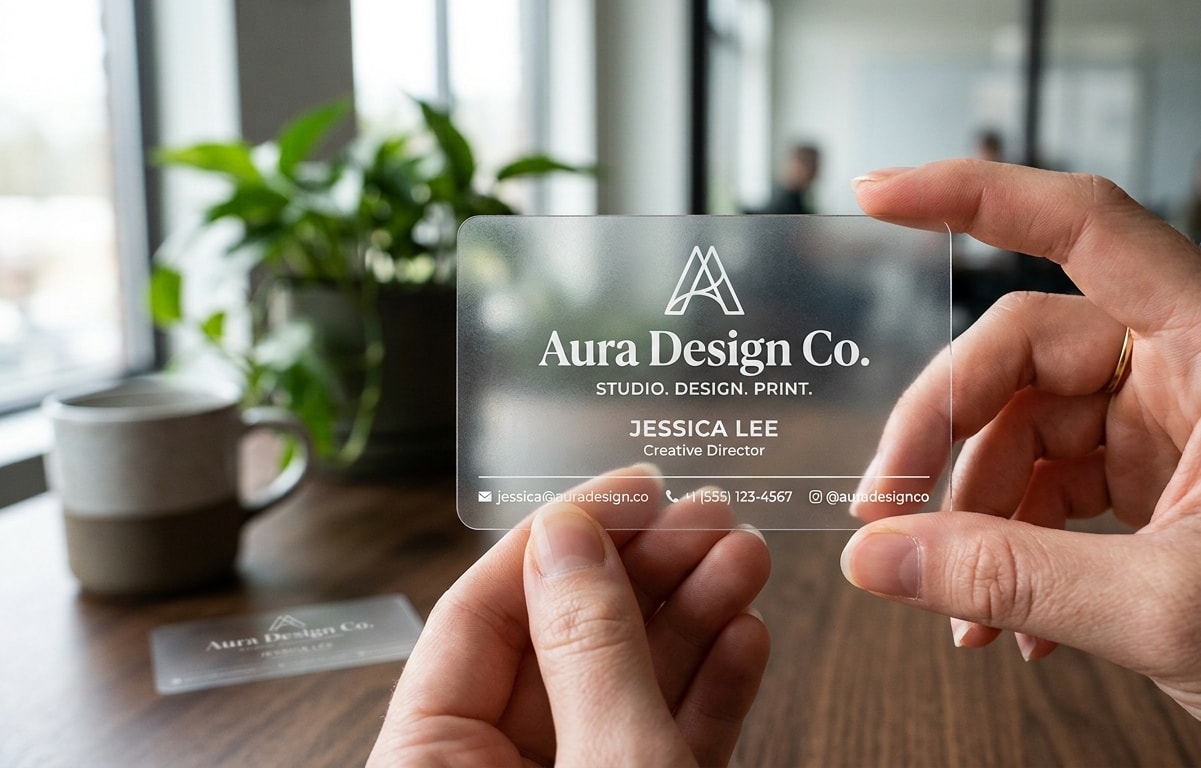
Understanding it is important for anyone looking to communicate effectively through the design of their business card. Typography itself involves the selection and arrangement of type to make written content readable and visually engaging. This includes deciding the best font size, style, and spacing among letters and lines. Each choice plays a crucial role in how information is perceived and received.
Designers can choose from assorted types of fonts, each with its own character and purpose. Serif fonts, like Times New Roman, have small lines at the ends of their strokes and are often used in print for their readability and traditional appearance. Sans serif fonts like Helvetica lack these lines and offer a cleaner, more modern look, making them very popular fonts in digital media.
Script fonts mimic cursive handwriting, adding a personal or elegant touch, while decorative fonts are designed with unique embellishments to capture attention and set a specific mood or theme.
Beyond aesthetics, the psychology of fonts is a powerful tool in design. Similar to selecting colors, different fonts can evoke different feelings and associations in the viewer. For example, a sturdy serif font may convey reliability and respectability, which is ideal for a law firm, while a light sans serif might feel approachable and laid-back and be suitable for a tech startup.
Understanding the subtleties of a business card font enables graphic designers to select fonts that resonate with their message and values, thus improving the overall impact of their designs.

Typography in Business Card Design
It's a critical element in business card design. The right font choice can significantly enhance brand perception and ensure the card stands out.
When choosing the best business card fonts, consider factors aligning with the company's industry, target audience, and brand personality.
The target audience is crucial. A font that appeals to a tech-savvy younger demographic might not resonate well with a more traditional group. Their effective use can be seen across various industries. Luxury brands may use elegant, custom fonts to convey exclusivity, while fitness companies might choose dynamic, energetic fonts to reflect vigor and movement.
By thoughtfully when selecting, businesses can craft a business card that not only conveys information but also subtly communicates their core values and attracts the right clients.
Legibility and Readability
Legibility and readability are crucial in typography, especially for business cards, where space is limited and every detail counts. These aspects guarantee that the card's essential information is visible and easy to understand at a glance.
Font Size and Spacing
Choosing the right font size and spacing is crucial in achieving good readability. For business cards, it is crucial to balance the text size so that it is neither too small to read comfortably nor too large to fit neatly on the card.
Body text should typically be a minimum of 8 points, but this may vary based on the point size and font chosen, as some fonts are more readable at smaller sizes than others. Adequate line spacing, known as leading, enhances legibility and prevents clutter.
Color Contrast
The impact of color and contrast is crucial for readability. High contrast between the text and the background, such as black text on a white background, can make the information pop and be quickly readable at a glance.
Depending on the card stock, adding special finishes like embossing or foil stamping can add a tactile element and visual interest to business cards. Embossing creates a raised effect that highlights essential details or creates a sophisticated look.
At the same time, foil stamping can add a shine and luxury feel, which is particularly effective for brands wanting to convey exclusivity or high quality. These finishes not only enhance the aesthetic appeal but also contribute to the legibility and overall impact of the typography by adding depth and texture.
Special Features
Adding special finishes to the design can significantly enhance its quality and detail, especially regarding the fonts used for the business card. One popular option is Spot UV coating, which gives certain parts of the card, like text or logos, a glossy, slightly raised texture.
This can give your business card a striking contrast with its shiny finish against the matte background. This technique is particularly great for highlighting key design elements such as your company name, logo, or name.
First impressions are everything! Stamped Foil involves applying metallic foil to selected areas of the business card. It is commonly used to highlight specific details you want to stand out from the design, such as the business card fonts.

Hierarchy Principles
Creating a visual hierarchy with typography is crucial for designing business cards and other marketing materials like postcards, presentation folders, and more. This approach is similar to how content is organized in a blog or newspaper article, where the layout is strategically structured to enhance legibility and understanding.
For example, in a newspaper, headlines are prominent, subheadings are slightly less so, and body text follows in smaller fonts, guiding the reader through the content smoothly. Similarly, on a business card, the layout should effortlessly direct attention to the most crucial information first.
Simply arranging text and visuals, you can guide the viewer's eye through the most important information in a logical, aesthetically pleasing order. This improves the clarity of the message and the overall impact of the business card design.
Creating a Visual Hierarchy
To create a visual hierarchy, you start by determining which information is most important. This is typically the name on a business card, followed by the job title and contact information. By using different font sizes and styles, you can make the most important details more eye-catching.
For example, the name might be printed in a larger, bolder font at the top of the card, immediately catching the eye. Below that, the job title could be in a smaller font size but maybe in the same font or style, maintaining a visual connection while indicating its secondary importance.
Techniques for Using Typography
One effective technique is to vary font weights for emphasis. A heavier font weight can make a word or phrase jump out, while lighter weights recede into the background.
The contrast in typefaces also helps; you might use a more distinctive, stylish, or elegant font for the name and a simpler, more readable font for the contact details.
Design Tip: You can experiment with different weights within the font family to establish a consistent appearance.
Emphasis Techniques
Other powerful ways to emphasize details are using bold, italics, or color. Bold is particularly useful for names and titles, making them pop against other text. While more subtle, Italics can be used for areas such as quotes or to highlight a unique selling point or slogan.
When used moderately, color can effectively draw the eye. For example, printing your name or business name in bold while keeping other information in black or gray can focus attention where you want it.
These techniques enhance a business card's aesthetics and functionality by making the information hierarchy clear at a glance. This makes key details immediately noticeable, which is especially important in professional networking scenarios such as trade shows or real estate meetings.

Innovative Typography Trends
Typography constantly evolves, and keeping up with the latest trends can give your business card a fresh, more modern feel and look. Below, we'll explore some of the current trends in typography that are becoming popular for creating eye-catching business card designs.
Latest Trends in Typography
Graphic designers are increasingly favoring minimalist and clean typefaces to convey simplicity, maintain clarity, and provide a sophisticated look. Bold and oversized fonts are also in style, making a statement and catching the eye quickly. For a dynamic feel, designers mix fonts by pairing a robust serif with a delicate sans serif font to create contrast and visual interest.
Experimental Typography
Using creative and experimental typefaces can set your business card apart, but balancing innovation with professionalism is important. To effectively incorporate experimental typography, consider the following:
- Choose the Right Occasion: Experimental fonts are more suitable for creative industries like graphic design, fashion, or advertising. Selecting a traditional or modern font is better in more conservative fields.
- Limit the Use of Experimental Fonts: Use multiple fonts selectively, perhaps for your name or the company name, while the contact information remains in a more readable, traditional font.
- Test Legibility: Always ensure it remains legible, particularly when printed on a business card in smaller sizes. Print a sample to see how the small text looks and assess its readability.
Graphic Design Tip: Consider getting a second opinion from a colleague or a friend to provide feedback on the design and text clarity.
Experimenting with unique fonts can make your business card memorable and unique, but the key is to use them thoughtfully to enhance, not overpower, the card's professional essence.
Common Font Mistakes to Avoid
Your business card serves as a mini billboard and a powerful tool for making a first impression. However, just like any billboard, a cluttered design and confusing typography can leave a negative impact. Let's address two common typography mistakes that can undermine the effectiveness of your business card.
Text Avalanche: When Less is More
Business cards are small. Cramming them with excessive text creates a visual avalanche, overwhelming potential clients and burying your contact information. Here's why it backfires:
- Readability Roadblock: Dense blocks of text are difficult to read, especially on business cards. Strained eyes can lead to missed opportunities!
- Information Overload: Too much information bombards the recipient, making it difficult to find your contact details in a sea of business clutter, and they may forget your card.
- Design Disaster: Text overload disrupts the visual balance of your card, resulting in a messy and unprofessional appearance.
Font Craze: Maintaining a Cohesive Look
A business card font plays a crucial role in your design, reflecting your brand personality and guiding the viewer's eye. However, too many fonts can create typographic noise and confuse the viewer.
- Clashinf Fonts: Mismatched font style, such as a playful script next to a rigid serif, similar to shouting your message in discordant voices.
- Hierarchy Havoc: Overusing fonts makes establishing a clear information hierarchy on your business cards difficult. The most important content gets lost in the visual noise.
- Unprofessional Presentation: Using a chaotic mix of fonts gives off an amateurish vibe and undermines the credibility you want to establish.
Remember to avoid these two crucial typography pitfalls in order to transform your business card into a clear and impactful mini-billboard. Prioritize essential information, use white space effectively, keep font choices concise and complementary, and let your brand personality shine through!

Best Fonts for Business Cards
Please remember that We have listed some of the best fonts to use when creating your business cards. However, keep in mind that the best font choice depends on your specific brand identity and target audience. Some fonts may not work for you, while others may inspire ideas for your design.
Classic and Professional
- Times New Roman - A traditional serif font is known for its readability and formal appearance.
- Garamond - Renowned for its elegant style and classic serif typography, Garamond radiates sophistication and historical significance.
- Baskerville - A serif typeface with a more dignified appearance, providing exceptional legibility and a style that conveys reliability and authority.
Modern and Professional
- Helvetica -Celebrated for its clean and neutral design, it is a modern typography staple suitable for text and display use.
- Futura - Known for its geometric shapes and straightforward appearance, Futura offers a distinctly modern aesthetic that’s perfect for minimalist designs.
- Roboto - Roboto is designed for digital readability. Its friendly, open curves make it ideal for modern user interfaces and minimalist layouts.
Creative and Bold
- Playfair Display - With its high contrast and distinctive style, Playfair Display is a bold serif that works well for headlines and titles, adding a touch of elegance.
- Oswald - A reworking of the classic gothic typeface style, Oswald has been adapted for digital use. Its bold and condensed letters make it ideal for impactful headings.
- Montserrat - Montserrat is known for its versatility and contemporary flair. It offers multiple weights, and its bolder options provide a strong, modern look for creative designs.
Conclusion
A well-designed business card is a powerful tool for representing your brand's identity and making a lasting first impression. Typography is at the heart of this design, ensuring the text is legible, readable, and visually appealing.
Choosing the right fonts, sizes, spacing, and high color contrast can significantly enhance the readability and impact of your business card. Visual hierarchy also plays an important role, as we discussed how it helps guide the viewer's attention to the most critical information first.
By thoughtfully using typography, you can create a business card that effectively conveys your brand's values and attracts the right clients.
Mastering typography can elevate your business card from a simple contact tool to a memorable extension of your brand.
Have a marketing project in mind? Whether you're jazzing up your business marketing or spreading the word about your next big event, we're here to help. At Print Cartel, we're all about turning your ideas into reality—let's make it happen together!