
Key Takeaways
Typography does more than display text. It shapes how a message is perceived and plays a direct role in clarity, credibility, and brand recognition in print.
- Font choice influences first impressions, helping convey professionalism, creativity, trust, or tradition before any content is read.
- Printed materials place greater demands on typography, as paper texture, ink spread, and viewing distance all affect readability.
- Each font category serves a distinct purpose, with serif, sans serif, script, and display fonts best suited for different design goals.
- The success of a print piece depends on matching font selection to the project’s purpose, audience, and format, whether for business cards, postcards, packaging, or flyers.
- Limiting font use, creating a clear visual hierarchy, and testing designs before final print helps maintain consistency and avoid costly revisions.
Typography does more than display words. It shapes how a message feels before anyone reads a sentence. The font you choose can suggest trust, creativity, confidence, or tradition in a single glance. In print design, where texture, paper, and finish already influence perception, font choice becomes even more important.
Whether you are designing business cards, postcards, flyers, or packaging, or EDDM postcards, choosing the right font helps your message feel intentional and clear. The right typographic choice always reflects the project's specific needs.
This guide outlines how to choose fonts, when to use specific styles, and how to avoid common mistakes that weaken printed designs.
Remember, choosing type is a decision-making process that should honor the content and ensure your font selection supports and elevates the message you want to convey.
Why Font Choice Matters in Print
Fonts are often the first thing people notice, even if they cannot explain why. A clean, readable typeface can make a brand feel polished and reliable.
A playful font can signal creativity and warmth. A poor font choice can make even a high quality print piece feel rushed or confusing. Choosing typefaces that reflect a brand's values can help attract the right kind of customers.
In print, fonts must work harder than they do on screens. Ink spread, paper texture, and viewing distance all affect legibility.
A font that looks great on a laptop may lose clarity once printed, especially at small sizes. Avoid relying on trendy or popular typefaces. They can quickly become outdated.
Instead, choose timeless, classic typefaces to make your design remain relevant and enduring.
Good font selection supports three goals:
- Clarity, so the message is easy to read
- Consistency so the brand feels recognizable
- Tone so the design matches the purpose
Tip: Creating a visual hierarchy in typography can be achieved by using different font sizes and styles.
Understanding the Main Font Categories
Before choosing a font, it helps to understand the main families used in design. Each group carries its own personality and practical strengths.
Serif Fonts
Serif fonts include small strokes at the ends of letters. These fonts often feel traditional, established, and formal.
Common uses include editorial layouts, luxury brands, law firms, and formal stationery. Serif fonts work well in printed paragraphs because the letter shapes guide the eye along the line.
Examples of serif fonts include Times New Roman, Garamond, and Baskerville.
Serif fonts are ideal for:
- Long form text in print
- Brands that want a classic or refined feel
- Projects where credibility matters
Design Tip: A good example of font pairing is using a big and bold serif for your headline and a nice traditional serif typeface for the body copy.
Sans Serif Fonts
A sans serif typeface does not include decorative strokes, making it highly readable for body text, especially on digital screens. They tend to feel clean, modern, and direct.
These fonts are widely used in branding, signage, and marketing materials because they remain readable at many sizes. In print, sans serif fonts often perform well on business cards and postcards.
Examples include Helvetica, Arial, and Open Sans.
Sans Serif is best for:
- Short messages and headlines
- Modern brands
- Clear calls to action
Did You Know: Sans-serif fonts are preferred for on screen reading and digital screens due to their clean lines, while serif fonts are considered classic for long-form print texts.
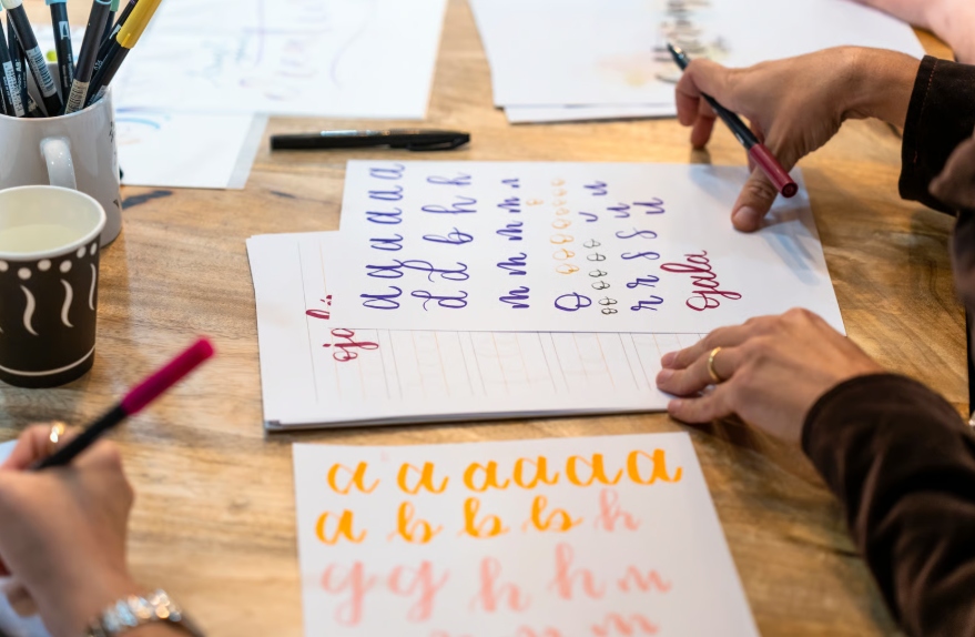
Script Fonts
Script fonts mimic handwriting or calligraphy. They feel personal, expressive, and decorative.
While visually appealing, script fonts can be difficult to read in large blocks or at small sizes. In print, they work best when used sparingly.
Examples include Pacifico and Allura.
They are best used for the following projects:
- Logos and accents
- Invitations and creative brands
- Emphasis rather than body text
Display Fonts
Display fonts are designed to stand out. They come in many styles, from bold and playful to sharp and dramatic. These fonts are often used for headings, headlines, posters, and signage to create visual hierarchy and improve readability.
Certain fonts work best in headlines or headings, while others are better suited for paragraphs.
These fonts should be used carefully. They add personality but can overwhelm a design if overused.
This type of font can be used for:
- Headlines
- Posters and signage
- Short attention grabbing phrases
Matching Fonts to the Project Goal
The right font depends on what the printed piece is meant to do. A postcard promoting an event has different needs than a business card meant to build trust. Font requirements can also change in different contexts, such as for titles, headers, tables, or paragraphs.
For most projects, it’s best to stick to one or two typefaces to avoid visual clutter. But the number of typefaces you use can vary depending on the project requirements and context.
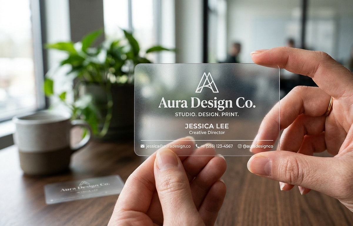
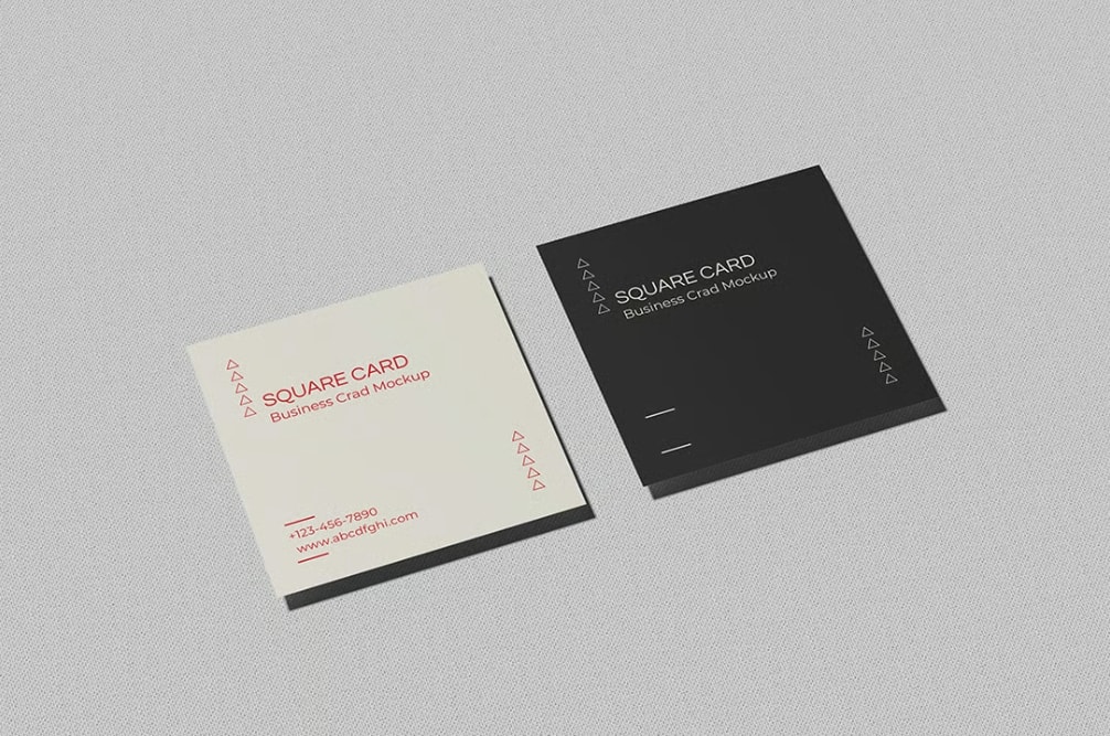
Business Cards
The type of font used on business cards should be clear, readable, and professional. Since they are small, space is limited. That's what simple fonts work best. Using one typeface throughout your business card design creates consistency and a cohesive look. To further elevate your design, consider exploring different paper options for business cards that can enhance professionalism and appeal.
Choosing a flexible font, such as Libre Baskerville, which offers style variants, can add nuanced visual interest while maintaining simplicity.
Sans serif fonts are a popular choice for names and contact details. Serif fonts can work well for brand names if they remain legible at small sizes.
Avoid using more than two fonts on a business card. Too many styles create visual noise. Limiting your font selection to 2-3 fonts helps maintain visual harmony and prevents slow loading times.
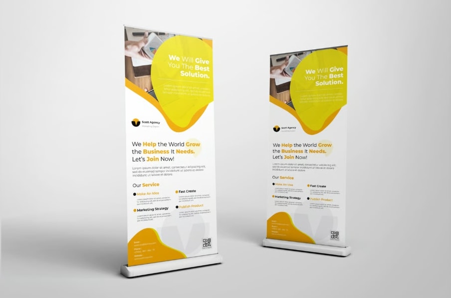
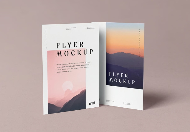
Flyers and Postcards
Designing flyers or postcards often relies on hierarchy. Headlines should stand out, while supporting text remains easy to read.
A common approach is pairing a bold headline font with a simple body font. This creates contrast without confusion.
Always test small text sizes before printing to confirm readability.
Packaging and Promotional Print
Packaging often aims to tell a brand story. Font choice should reflect the product's personality and target audience.
A natural food brand may choose soft, rounded fonts. A tech focused brand may prefer sharp, minimal letterforms.
Consistency across packaging and marketing materials helps build recognition.

How Many Fonts Should You Use
A strong print design usually uses one or two fonts. One font can work well when different weights and sizes are used. This keeps the design cohesive.
Two fonts often provide the best balance. One font handles headlines, while the other supports body text.
Using too many fonts makes a design feel scattered and unpolished.
Tip: Use different font weights and sizes to guide the audience's eye toward key information in presentations. It's recommended to limit your design to 2–3 typefaces to avoid a chaotic look.
Common Font Mistakes to Avoid
Even well intentioned designs can suffer from poor font decisions. Watch out for these issues.
- Using decorative fonts for long text
- Mixing too many styles
- Choosing fonts that look good on screen only
- Ignoring spacing and line height
- Overcrowding small print areas
Simple choices often lead to better results.
Testing Before Final Print
Before sending a file to print, it is important to take a final pass at your font choices to confirm they perform as intended on paper. This often overlooked step can save you a lot of time by catching issues early, preventing costly revisions and delays.
Printing a sample allows you to see how the fonts appear at actual size, especially smaller text that may look clear on screen but feel crowded or faint in print. This step also helps you confirm proper spacing, alignment, and overall balance within the layout.
Finally, review whether the typography still reflects the right brand tone and level of professionalism. A careful review at this stage can prevent unnecessary revisions and help avoid costly reprints.
Final Thoughts
Choosing the right font is not about trends or rules. It is about clarity, purpose, and fit. A thoughtful font choice helps your message feel intentional and professional, especially in print, where first impressions last. The emotional response to the shape of letterforms is a very personal experience for readers.
At PrintCartel, we see every day how typography can strengthen a design or hold it back. When font choices align with the project goal, paper, and audience, printed materials feel confident and well considered. Creating contrast with typography and your secondary font can enhance structure and clarity in design.
If you ever feel unsure, start simple. Choose readability first, personality second, and consistency always. The right font will support your message without stealing attention from it.
There are many web font options available, including free options like Google Fonts, which offer a wide variety of styles, character sets, and language support. Non-designers can easily access these fonts using user-friendly tools, making it simple to find the right font for any project.