Key Takeaways
Popular graphic design fonts shape readability, tone, and brand perception, helping designers communicate professionalism, personality, and clarity across print and digital projects.
- Classic fonts remain widely used. Timeless typefaces are trusted for their readability and versatility across many design styles.
- Modern fonts signal current design trends. Clean, minimal typefaces are often chosen for brands that want a fresh and contemporary look.
- Font choice affects brand voice. Serif, sans serif, and display fonts each communicate different moods, from formal to creative.
- Readability always comes first. Popular fonts are often favored because they perform well at different sizes and across formats.
- Consistency matters. Using the same fonts across business cards, marketing materials, and branding helps build recognition and cohesion.
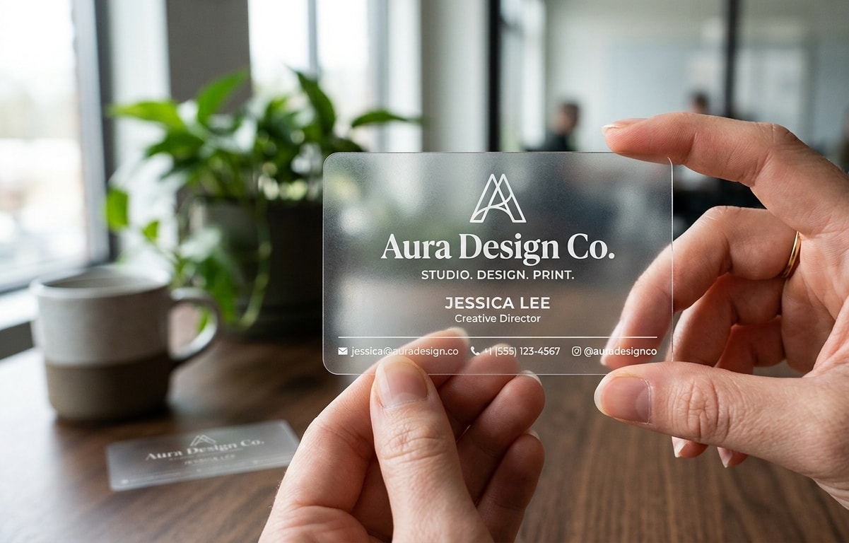
The right font can completely transform a design. Whether you're creating a sleek logo, developing marketing materials like business cards, designing eye-catching advertisements, or building a visually engaging website, your font choice directly shapes the look and feel of your project.
While there are countless fonts available, a select few have become favorites among designers worldwide—not because of cost, but because of their craftsmanship. These fonts balance readability, versatility, and timeless style, adapting beautifully across various layouts, languages, and design needs.
Fonts do more than display words; they set tone, express personality, and influence how your audience perceives your brand. Choosing the right one can be challenging, but understanding what makes certain fonts so widely used can help guide your decision.
In this guide, we’ll look at some of the most popular fonts in graphic design, their defining qualities, and how they contribute to creating visually cohesive and impactful designs.
Some of the Top Fonts for Designers
Fonts do more than display text; they communicate visually. We'll highlight some of the popular fonts to understand how they improve graphic design.
Helvetica
Designed in 1957 by Max Miedinger and Eduard Hoffmann, Helvetica is one of the most iconic and widely recognized sans-serif typefaces in design history. Inspired by the 19th-century typeface Akzidenz-Grotesk, Helvetica was created with clarity and simplicity in mind. Over time, it has expanded into an extensive family of weights, widths, and styles, with support for numerous non-Latin alphabets.
Its clean, modern appearance has made it a go-to choice for brands aiming for a professional and timeless look. Companies such as Jeep, Lufthansa, 3M, Panasonic, American Apparel, Target, JCPenney, Skype, and The North Face have all incorporated Helvetica into their branding.
Known for its balance, versatility, and effortless readability, Helvetica remains a staple in corporate branding, logo design, and a wide range of print and digital projects.
Times New Roman
Times New Roman is one of the most recognizable and enduring typefaces in the world. Designed in 1931 by Stanley Morison and Victor Lardent for The Times newspaper in London, it was created to improve legibility and space efficiency in print.
As a serif font, Times New Roman carries a traditional and refined aesthetic that conveys credibility and professionalism. Its balance of elegance and clarity has made it a standard choice for newspapers, books, academic papers, and formal documents.
With its timeless design and proven readability, Times New Roman continues to be a trusted font across print and digital media alike.
Garamond
Garamond is one of the oldest and most distinguished serif typefaces still in use today. Originating in the sixteenth century, it was designed by Claude Garamond, a renowned Parisian engraver whose work was inspired by classical Roman letterforms.
Known for its graceful curves, balanced proportions, and refined details, Garamond offers a timeless sense of sophistication. Its elegant appearance makes it a popular choice for luxury brands, advertising agencies, and book publishers seeking a polished, high-end look.
Blending readability with classic style, Garamond remains a favorite among designers who value tradition and elegance in their typography.
Baskerville
Baskerville is a classic serif typeface known for its refined, transitional style that bridges the gap between old-style and modern serif designs. Created in the 18th century by John Baskerville, this font is celebrated for its sharp contrasts, elegant curves, and precise detailing.
Its sophistication and readability make it a popular choice in book design, branding, and advertising—particularly for projects that aim to convey trust, quality, and timeless appeal. Baskerville’s polished look continues to make a strong impression in both print and digital applications.
Georgia
Georgia is a widely used serif typeface designed by Matthew Carter for Microsoft, with the goal of achieving exceptional readability on digital screens. Its gently curved serifs and well-balanced letterforms give it a warm, approachable look while maintaining clarity, even at smaller sizes.
Blending classic elegance with modern functionality, Georgia is a favorite for websites, blogs, and digital publications. Its readability and professional appearance make it a reliable choice for both on-screen and print designs.
Arial
Arial is a widely recognized sans-serif font introduced in 1982. Its inclusion in both Windows and macOS helped make it a go-to choice for designers across industries. Today, it’s also available through Google Fonts, making it easy to access and use for any project.
Known for its clean and straightforward design, Arial delivers excellent readability across digital and print formats. Often compared to Helvetica, it stands out for its crisp clarity and smooth appearance on screens—qualities that have secured its place as a reliable standard in modern design.
Roboto
Roboto is a modern sans-serif typeface admired for its clean geometry and approachable style. With its balanced lines and open curves, it offers a contemporary yet welcoming appearance that has made it a favorite among graphic designers.
Its strong readability across all sizes—from bold headlines to detailed body text—makes Roboto a versatile choice for both digital and print designs. Designers appreciate its clarity, consistency, and adaptability, making it a dependable font for projects that demand a polished, modern aesthetic.
Gill Sans
Gill Sans is a classic sans-serif typeface recognized for its rounded shapes and timeless appeal. Available in multiple weights, it provides designers with the flexibility to create both bold statements and subtle text treatments. Its refined yet approachable design makes it a favorite among brands, advertisers, and print professionals looking for a stylish and recognizable typeface.
Notable brands, including The Guardian, BBC, The New York Times, Airbnb, and Spotify, have all used Gill Sans in their visual identities. Whether used for body text, logos, or digital layouts, Gill Sans continues to be a trusted choice for achieving a clean, modern, and sophisticated look.
Proxima Nova
Proxima Nova is a modern sans-serif typeface celebrated for its clean, geometric design and exceptional versatility. Its balanced proportions and contemporary style make it a go-to choice for designers working across branding, web design, and digital interfaces.
With a wide range of weights and styles, Proxima Nova delivers both readability and visual appeal, ensuring a polished and professional look in any project.
Lato
Lato is a sleek and friendly sans-serif font known for its smooth curves and professional appearance. Designed with both warmth and structure, it offers excellent legibility across digital and print formats. Its versatility makes it a popular option for everything from corporate branding to website typography, providing a clean, modern aesthetic that feels approachable and refined.
Franklin Gothic
Franklin Gothic is a classic sans-serif typeface introduced in 1902 by American Type Founders under the direction of Morris Fuller Benton. At the time, the term “Gothic” was commonly used to describe sans-serif fonts, highlighting their straightforward and geometric design.
Known for its bold and confident presence, Franklin Gothic is frequently used for headlines, signage, and display text. Its strong visual impact and timeless style have made it a staple among designers around the world, continuing to convey clarity and authority in modern design projects.

Additional Fonts: Unique and Creative
For a distinctive and visually appealing typeface, consider the following options:
- Pacifico – A casual handwritten font with a playful and friendly feel. Its flowing strokes add warmth and personality, making it perfect for branding, social media graphics, and invitations.
- Lobster – A handwritten font with a vintage twist. Its bold, expressive letters bring charm and character to headlines, logos, and branding.
- Fira Sans – A clean, geometric sans-serif font designed for clarity and versatility. Ideal for websites, apps, and user interfaces thanks to its excellent readability.
- Bebas Neue – A modern, bold typeface known for its all-uppercase design. Perfect for posters, titles, and projects that need a strong visual impact.
Most Common Font Styles in Graphic Design
Fonts in graphic design generally fall into three main categories: serif, sans-serif, and script.
- Serif fonts: Like Times New Roman and Garamond—feature small decorative lines at the ends of letters, giving them a traditional and elegant look.
- Sans-serif fonts: Include options such as Helvetica and Arial, which have a clean, modern appearance without those decorative strokes.
- Script Fonts: They include Lobster and Pacifico, imitate natural handwriting, and are often used to add a personal or decorative touch to designs.
Importance of Choosing the Right Font for a Design Project
Choosing the right font for a design project is crucial, as it can affect the design's overall mood, tone, and readability. Different fonts can evoke different emotions and convey different messages, so choosing a font that aligns with the project’s goals and target audience is important. The font should be legible and easily read, especially for body text.
Fonts: The Unsung Heroes of Design
Fonts are often overlooked in favor of eye-catching visuals and bold colors, yet they play a crucial role in shaping graphic design's overall look and impact. Choosing the appropriate font can improve readability, evoke the intended atmosphere, and leave a lasting impact on the viewers.
Mood and Tone
Fonts play a key role in setting the emotional tone and overall feel of a design. A well-chosen typeface can instantly communicate style, personality, and intent.
For example, Georgia combines beauty and readability, making it especially effective for clear text on low-resolution screens.
Similarly, Times New Roman, a serif font, conveys tradition and professionalism, while Helvetica, a sans-serif font, reflects modernity, simplicity, and a clean aesthetic.
Legibility
When creating text-heavy designs like postcards or banners, readability should always be a top priority. Clean sans-serif fonts are often preferred for their clarity and adaptability across different formats.
Selecting a clear and easy-to-read font helps allows your message is understood at a glance. Elements such as font size, line spacing, and color contrast also play an important role in maintaining strong readability and visual balance.
Visual Appeal
The visual appeal of a font plays a major role in shaping the overall look and feel of a design. Display fonts, often used for headings and titles, feature bold geometric forms and refined serifs that naturally draw attention. Choosing the right typeface helps create balance, harmony, and visual interest throughout your design.
Below are some of our favorite fonts to inspire your next print or design project.
Final Thought
Choosing the right font in graphic design is like finding the perfect finishing touch that brings your project to life—whether it’s for print or digital use.
Fonts do so much more than just look pretty! They help you and your business convey your message and set the mood for whatever you're trying to create.
You want your audience to easily digest what you’re saying without squinting or getting frustrated. So, next time you're starting a new design project, remember that the right font isn’t just about aesthetics; it’s about improving communication and ensuring that your message is easily understood.