
Key Takeaways
Good door hanger design comes down to clarity, hierarchy, and a call to action people can actually follow through on.
- One goal per hanger. Door hangers that try to say too much end up saying nothing — pick one offer, one message, one action.
- The headline carries the weight. Most people scan for about two seconds, so your headline needs to tell them exactly what's in it for them.
- Visual hierarchy moves people through the design. Font size, contrast, and spacing should guide the eye from headline to CTA without any conscious effort from the reader.
- The back of the hanger is valuable space. A lot of businesses leave it blank or fill it with fine print — both are missed opportunities.
- Print quality affects how the piece gets received. Flimsy paper and muddy colors can undercut an otherwise solid design before anyone reads a word.
A door hanger has one advantage that most marketing pieces don't. It physically can't be ignored. There's no spam filter, no crowded mailbox, no competing inbox.
Someone has to physically touch it to get into their home.
But, most door hangers get tossed within seconds. Not because door hangers don't work, but because the design doesn't give people a reason to keep reading.
Find out what goes into a door hanger design that gets a response, from layout decisions to print specs.
Start With One Clear Goal
Before you open a design file or hand the job off to a print company, answer one question.
What do you want the reader to do?
Door hangers are a small format with limited real estate. Every design element, the headline, the image, the contact info, should support a single objective.
If you're a landscaper running a spring special, the door hanger should be about the spring special.
When businesses try to include everything, the full service list, the company history, and the awards, nothing stands out. The reader's eye bounces around.
They don't get a clear takeaway. The result can be the trash. Decide how you want them to respond, whether it’s a phone call, visiting your website, a coupon, etc. Then build the whole piece around that.
Lead With the Benefit, Not the Brand
Your logo does not need to be the biggest thing on the door hanger.
Most people receiving your hanger don't know your brand yet. They don't care about your company name in the first two seconds. They care about whether it's worth their time. So give them a reason fast.
Your headline needs to answer the question every reader asks the second they pick up your hanger. What's in it for me?
Compare these two approaches:
- "Smith's Lawn Care — Serving the Metro Area Since 2003"
- "Get Your Lawn Summer-Ready for $99. Call Before May 31."
Which one do you think is better? If you said the second one, you’re right! It tells the reader exactly what they get, what it costs, and when they need to act.
Use Hierarchy to Guide the Eye
Visual hierarchy is how you control the order in which someone reads your design. The reader just moves naturally from one element to the next without thinking about it.
The basic structure for a door hanger:
- Headline (largest, highest contrast)
- Supporting detail or subhead
- Call to action (bold, easy to find)
Watch out for font sizes that are too similar, text blocks that compete for attention, and layouts where everything is centered but nothing stands out. Whitespace is not wasted space. It helps important elements breathe and stand out.
If someone can pick up your door hanger and identify the offer and the next step in under three seconds, your hierarchy is working.
Pick Colors That Work at a Glance
Color does two things on a door hanger. They are used to attract attention, and it affects readability. Both are important.
High contrast between text and background is non negotiable. Dark text on a light background, or the reverse, is the baseline.
Where designers get into trouble is layering text over busy images or using similar tones for text and background. Both make it harder to read fast.
Beyond contrast, think about how your colors translate to the print environment. Colors look different on screen than on paper, and they look different under porch lighting than under office fluorescents.
If you're printing in CMYK, which you should be for commercial print, make sure your design file is set up that way. Bright, saturated colors tend to work well for door hangers since they read quickly from a distance.
Print Design Tip: Designing in RGB and printing in CMYK is one of the fastest ways to end up with colors that don't match what you saw on screen.
Keep the palette tight. Two or three colors are usually enough. More than that, and the design starts to feel busy.
Write a CTA That's Easy to Act On
The call to action is the whole point of the door hanger. Everything else exists to get the reader to this moment, so make it count.
Three things a good CTA needs: clarity, specificity, and low friction.
Clarity means it's obvious what you're asking. "Call now," "scan to book," "visit our site," “Scan the QR Code.” Direct language, no guessing.
Specificity makes it more compelling. "Call for a free estimate" beats "call us." "Get 20% off your first order" beats "learn more."
Low friction means the action is easy to take. A phone number should be large enough to read without squinting. A URL should be short, or, better yet, use a QR code that goes straight to a landing page. The fewer steps between reading the door hanger and completing the action, the better your response rate.
Design Tip:
Don't bury the CTA at the bottom in small text. It should be one of the most prominent things on the page.
Don't Overlook the Back
Most people look at both sides of a door hanger. That makes the back valuable space.
The front does the heavy lifting: a big headline, a key offer, and a main CTA. The back is where you can add supporting information without cluttering the front.
Not sure what to put on the back? Here are a few ideas.
- Secondary offer or seasonal promotion
- Short list of services (3 to 5, max)
- Social proof. Include a quote, a review, or a stat ("Over 500 homes served in [City]")
- Repeat of the CTA, in case the reader flips to the back first
If the information isn't helping the reader decide to act, you probably don’t need to include it.
Size, Finish, and Print Quality Matter
Design decisions don't end when you export the file. The physical product plays a real role in how your hanger gets received.
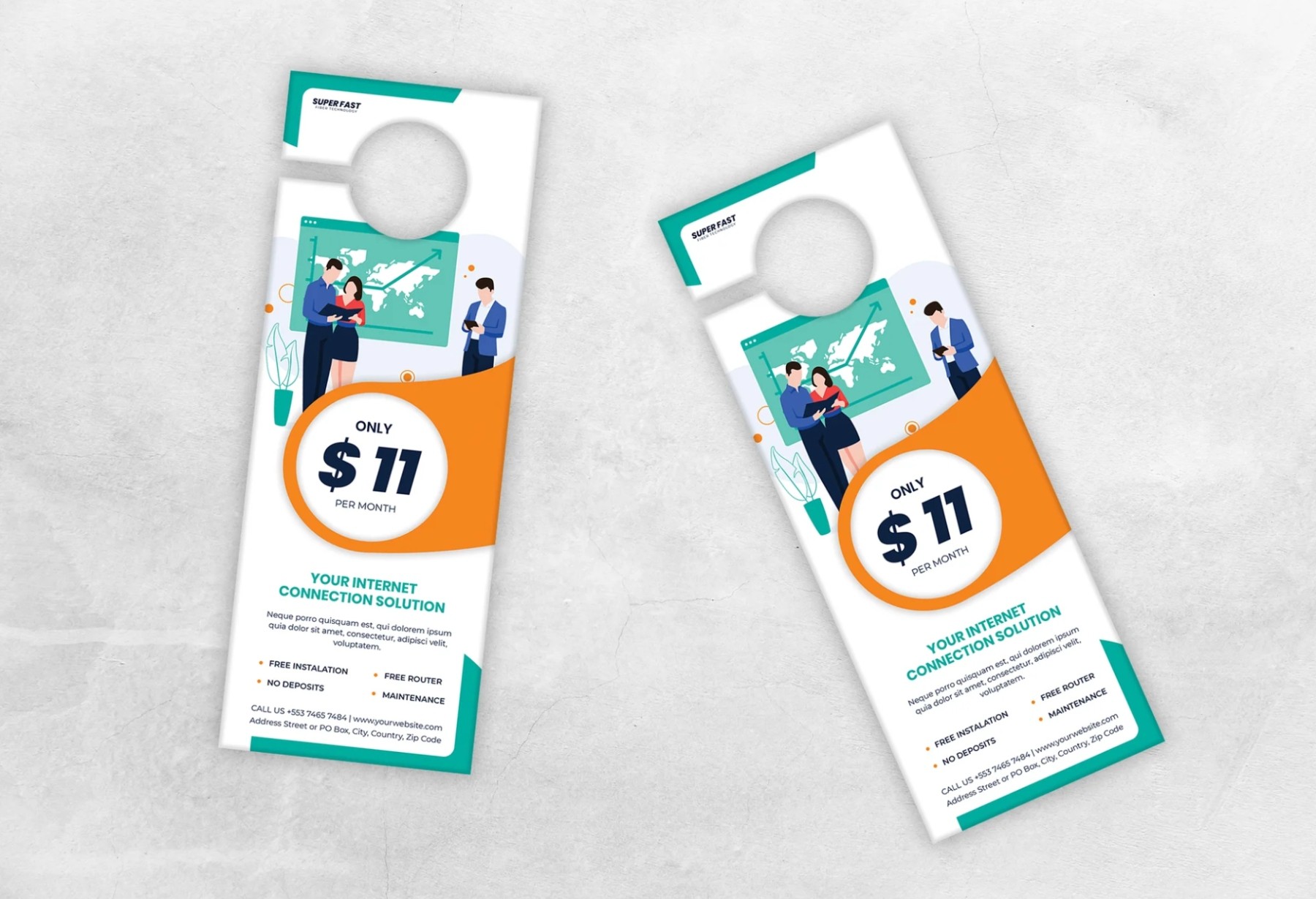
- Standard size is 3.5" x 8.5" with a die cut hole at the top. It fits standard door knobs and works for event or storefront distribution, too.
- Paper stock determines how the hanger feels and holds up. A 14PT or 16PT cardstock is the standard. Anything lighter feels cheap and won't survive outdoor conditions.
- Coating affects both look and durability. Gloss makes colors pop and gives the piece a finished feel. Matte is easier to write on. UV coating is the best option if the door hangers will be exposed to the weather.
Your door hanger, which looks well made, gets more consideration than one that looks like it was printed on a home printer.
Final Thought: Before You Print
A door hanger that gets responses isn't the result of any single design trick. It comes from making deliberate choices at every step: a focused goal, a headline that earns attention, a layout that's easy to follow, and a CTA that removes every barrier between the reader and the action.
The physical quality of the print matters too. A well designed hanger on the right stock, with the right finish, tells people something about your business before they read a single word.
If you're ready to print, Print Cartel makes it easy to get professional door hangers that show up looking sharp and ready to work.
Frequently Asked Questions About Door Hanger Design
What Is the Standard Size for a Door Hanger?
Most door hangers are 3.5" x 8.5" with a die cut hole at the top. That size has become the standard because it fits just about every doorknob out there and is easy to distribute at events or leave at storefronts.
How Many Colors Should I Use on a Door Hanger?
Two or three colors are usually plenty. More than that, and the design starts to feel cluttered. A tight palette actually makes your most important information easier to spot.
Gloss or Matte: Which Coating Is Better for Door Hangers?
It depends on how you're using them. Gloss makes colors pop and gives the piece a sharp, finished look. Matte is easier to write on and has a cleaner, more understated feel. If your hangers are going outside, UV coating is worth the upgrade for durability.
What Should I Actually Put on the Back of a Door Hanger?
A lot of businesses leave the back blank, which is a missed opportunity. A secondary offer, a short list of services, a good customer review, or even just a repeated call to action can all work well back there. Just make sure whatever you add supports the front instead of competing with it.