
Key Takeaways
Effective flyer design focuses on clear messaging, strong visuals, and layout choices that help readers quickly understand the purpose and value of the promotion.
- A clear headline and primary message help readers understand the offer within seconds.
- Simple layouts with strong visual hierarchy make flyers easier to scan and remember.
- Readable typography and balanced spacing improve clarity and prevent important details from being overlooked.
- Color and imagery should support the message while staying consistent with your brand identity.
- High quality printing and paper choices help flyers feel credible and increase the chance they will be kept rather than discarded.
If there’s one thing that’s true about flyers, it's that you only have a few seconds to grab someone's attention with a flyer before they decide to either keep it or throw it away.
So how do you go from a dull flyer that gets ignored to one that actually grabs attention and holds it? Creating an effective flyer is all about smart design, clear messaging, and top notch printing.
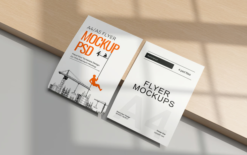
Creating flyers that are both visually striking and concise is crucial for grabbing attention and conveying your key message effectively. Here’s a simple, effective guide packed with tips to help you design flyers that people will actually want to read and keep.
Understanding Flyer Design Basics
Good flyer design is where your message meets your audience. It’s not just about looking nice; it’s about creating something that grabs attention and clearly shares what you want people to know. Unlike ads on screens that disappear with a click, a flyer sits in hands and minds, giving your message staying power.
When done correctly, a flyer establishes a genuine connection with potential customers and becomes a lasting tool in your marketing toolkit. Flyer design is a strategic part of advertising, offering an inexpensive way to promote a business, and its effectiveness depends on both design and smart distribution of marketing materials.
Start With a Clear Goal
Before you start designing your flyer, step back and ask yourself a bigger question: What exactly are you trying to achieve with your marketing right now? Are you a small business aiming to get your brand noticed, launch a new product, boost engagement, or maybe collect leads?
Knowing the specific result you want helps you decide if a flyer is the right tool to support that goal. It also keeps your message focused and powerful. When you have one clear purpose in mind, from inviting people to an event to promoting a sale, your flyer will know exactly what to say, and your audience will too.

Make Your Headline Impossible to Ignore
Your headline is the very first thing people notice on a flyer, it’s your chance to grab attention before they even think about reading further. A strong headline, supported by a clear visual hierarchy, should be bold, easy to read at a glance, and instantly communicate why someone should care. Treat it as your flyer’s handshake: clear, confident, and memorable.
When crafting your headline, consider what your audience values most. Phrases like “Buy One, Get One Free” or “Grand Opening This Weekend” work because they’re short, exciting, and promise an immediate benefit. You want people to stop, look, and feel like they can’t miss out.
Don’t be afraid to add a subheadline or small callout just under your main headline, either. This secondary line can expand on the promise of your headline or draw attention to an additional detail—such as a date, discount percentage, or limited-time offer.
Combined, the headline and subheadline set the tone for the rest of your flyer and guide the reader to keep engaging with your message.
Design That Matches Your Message
Your flyer’s design should support what you’re saying, not distract from it. Bright colors can grab attention, while clean fonts make your message easy to read. Keep plenty of white space so details don’t get lost.
Printed flyers are especially effective for event marketing, offering a tangible way to reach your audience and a chance to apply best practice guidelines for designing physical flyers. To make the design process easier and more efficient, you can use flyer templates that provide a ready made structure and style, helping you create professional-looking flyers quickly and effortlessly.
For example, a summer sale flyer might pair bold yellow headlines with simple black text for prices, creating an eye catching yet clear design.
Add Visuals That Speak Louder Than Words
The right visuals can instantly capture attention and bring your message to life. Consider using photos, icons, or illustrations that highlight your product or service in action. Showing real customers enjoying what you offer creates a sense of authenticity and builds trust at a glance.
Product images help people picture themselves using it, while icons and graphics can simplify complex ideas. You can even take it a step further with QR codes linking directly to videos, special offers, or your website to encourage immediate engagement and make your print piece interactive.
Visual Design Elements
- Always use high resolution images (300 DPI for print). Avoid pixelation.
- Create a clear focal point (photo, graphic, or bold headline).
- Use white space strategically (60% white space, 30% content, 10% visuals).
- Add icons for key info (map pin, phone, clock), keeping them simple and functional.
- Make sure all visuals support your main message and remain to the brand guidelines.
- Follow the 60-30-10 rule: 60% primary (neutral background), 30% secondary (brand colors), 10% accent (highlights/CTAs).
- Red = urgency/sales, Blue = trust/professional, Green = growth/health, Yellow = energy/optimism.
- Use brand colors consistently but add complementary shades for balance.
- Ensure accessibility with strong contrast (min. 4.5:1 for text). Test colors in different lighting and print settings.
Keep the Copy Simple, But Impactful
When it comes to flyers, less really is more. Most people will only give your piece a quick glance, so focus on short, easy to read sentences that get straight to the point. Break up information with bullet points or bold headers so key benefits stand out right away. Instead of just listing features, highlight what’s in it for your audience.
Whether that’s saving money, solving a problem, or making life easier. If appropriate, create a sense of urgency with phrases like “Limited Time Offer” or “Sale Ends Friday.” This not only grabs attention but also encourages readers to act quickly.
Creating a Call to Action That Gets Results
A flyer can look great, but without a strong call to action, it won’t deliver results. Think of it as the signpost that points people exactly where you want them to go. Your call to action should be bold, easy to spot, and leave no doubt about the next step.
Keep it short, clear, and action focused. For example:
- Event flyer: “Get your tickets today” or “Reserve your seat now.”
- Retail flyer: “Shop the sale” or “Visit us this weekend.”
- Service flyer: “Book your appointment” or “Call now to get started.”
The key is relevance; choose wording that fits your goal and motivates people to act right away.
If you want to simplify things, start with a flyer design that already clearly highlights the call to action. That way, your message stands front and center, guiding readers from curiosity to action. After all, it’s the call to action that turns attention into real results, so make it count.
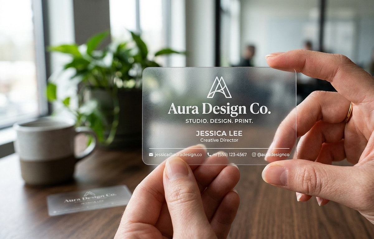
Print Quality Makes the Difference
The look and feel of your flyer can leave just as strong an impression as the words on it. A flimsy sheet with dull colors is easy to toss aside, while a flyer printed on heavier stock with crisp, vibrant inks instantly feels more professional and worth holding onto.
Finishing touches, such as a glossy coat for a bold, eye catching shine or a matte finish for a smooth, modern look, can elevate your design even further.
Interested in seeing the difference? Request a free sample packet today.
Smart Distribution
Designing and printing a high quality flyer is just the beginning; its success depends on where it’s seen. Placing your flyer in locations your audience already frequents, such as cafés, gyms, community boards, or local shops, ensures it reaches the right people at the right time.
To effectively advertise with flyers, consider the timing of your distribution, local weather conditions, and seasonal factors to maximize visibility and impact.
A thoughtful, targeted distribution strategy will always deliver better results than handing out flyers at random.
Common Mistakes to Avoid
- Cluttering your flyer with too many fonts, colors, or images overwhelms readers and buries important details. Stick to a clean, focused layout that highlights your message and makes it easy for your audience to find what matters most.
- Forgetting a clear call to action leaves readers unsure what to do next. Always include a direct prompt such as visiting a website, calling your business, or attending an event.
- Neglecting proofreading can cause typos or errors, making your flyer look unprofessional and damaging your credibility.
- Using generic flyer designs that don’t tailor to your target audience rarely get results. Use professionally designed templates and upload your own images and logos to make your flyer unique and memorable.
Avoiding these common pitfalls, your custom flyer will stand out, deliver your message clearly, and drive real results.
Final Thought
Creating a flyer that people actually stop to read isn’t about cramming in the most information, it’s about clarity, design, and quality. From setting a clear goal and writing a bold headline to choosing visuals that connect and ensuring all the essentials are easy to find, every detail matters. Just as important, the way your flyer looks and feels in someone’s hands can decide whether it gets noticed or tossed.
That’s where we can help. With premium paper stocks and professional finishes, we make sure your flyer delivers a message worth keeping. When paired with smart distribution, a well-designed and well printed flyer becomes more than just a piece of paper; it becomes a lasting connection with your audience.
If you’re ready to turn your next flyer from dull to delightful, start with Print Cartel and let your message stand out.