
Key Takeaways
White space is not empty space. It is a deliberate design choice that helps business cards feel clear, confident, and professional.
- White space helps business cards feel clear and organized by giving each element room to stand out.
- Proper spacing improves readability, making names and contact details easier to scan at a glance.
- Simple layouts with intentional spacing often feel more polished and professional.
- White space reduces visual clutter and keeps attention on the most important information.
- Thoughtful spacing improves print results by keeping text sharp and designs easy to reproduce.
Business cards are small, but the expectations placed on them are not. In just a few seconds, a card needs to communicate who you are, what you do, and whether you are worth remembering.
With so little room to work with, every design choice matters. One of the most overlooked and most effective choices is white space—a core design principle that greatly influences the effectiveness and visual appeal of your business card.
This article is a complete guide to using white space in business card design. White space is often misunderstood as wasted space.
In reality, it is a quiet design tool that helps your message feel clear, confident, and intentional.
When used well, it can turn an average business card into one that feels thoughtful and professional without saying a word.
What White Space and Negative Space Really Mean
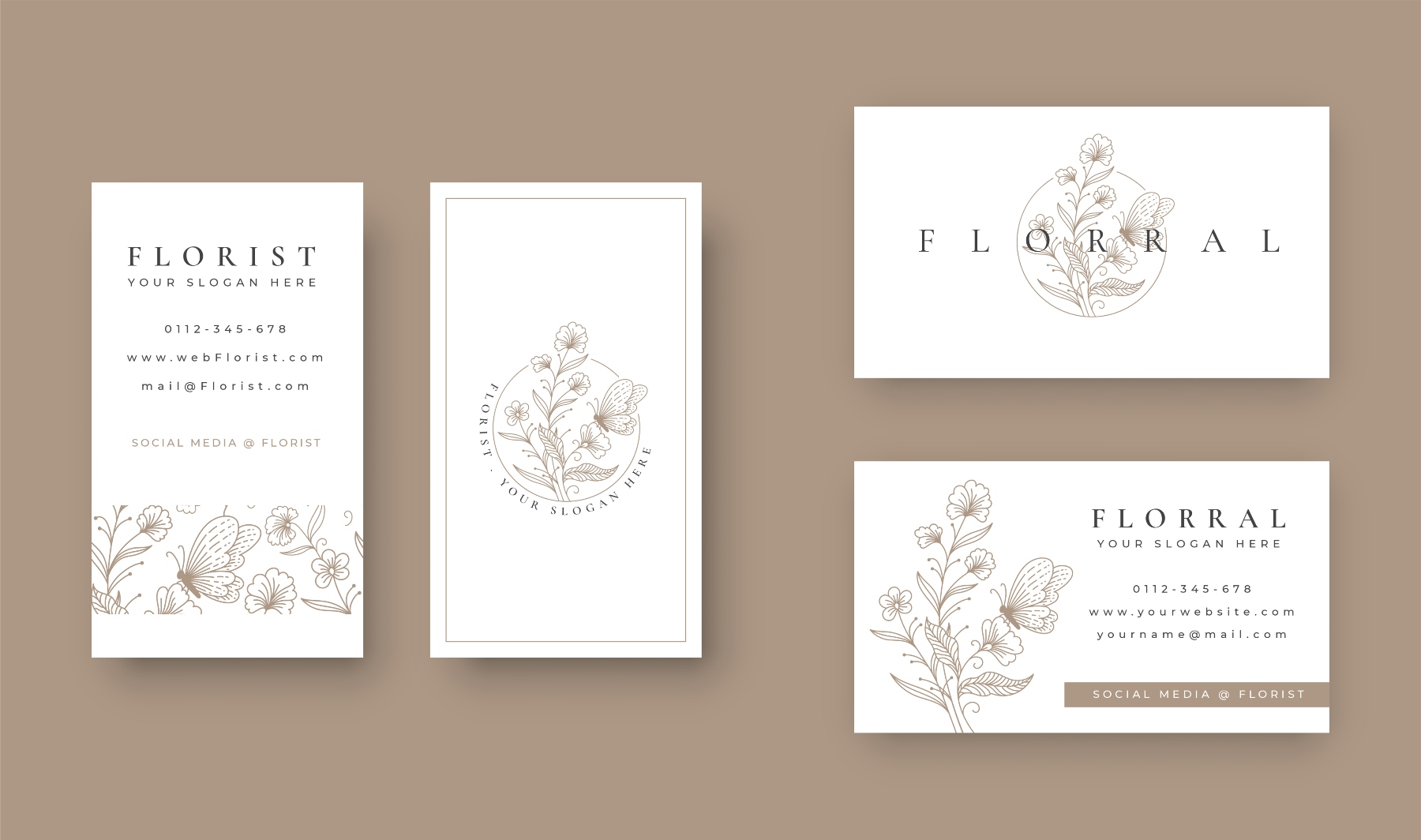
White space does not mean the card has to be white. It refers to the open areas around text, logos, and other design elements—also called blank spaces and often referred to as white space in design.
These spaces (also known as negative space) give each part of the design room to breathe and interact with visual elements and certain elements to create a balanced composition.
White space can be categorized by scale: macro white space refers to large areas, while micro white space refers to small spaces between or within elements.
There are also two main types: active white space, which is intentionally used to enhance page structure and guide the user through the content, and passive white space, which naturally occurs to improve the layout's aesthetics without directing the user's focus.
Think about reading a page with no margins and tightly packed lines. Even if the content is good, it feels harder to read.
The same thing happens on a business card or other marketing materials, including EDDM postcards, flyers, and more.
When everything is crowded together, the business card feels busy and the information blends into noise. White space creates separation. It tells the eye where to look first and what matters most.
Why White Space Matters on a Small Format
A business card has very limited space. Trying to fit too much onto it is one of the most common design mistakes. Phone numbers, email addresses, social links, taglines, logos, and icons all compete for attention.
White space solves this problem by forcing focus. When there is space around your name or logo, it becomes the natural focal point. White space helps organize content and separate elements, making the card easier to scan and each section easier to identify. When contact details are spaced properly, they are easier to scan, read, and remember.
Strategic use of white space can guide the user's attention to the most important information and help direct focus to key content. White space can also help guide the user through interactive content and build focal points to direct the user's attention to specific layout parts.
A card that feels calm is more likely to be read and kept. A card that feels crowded is more likely to be glanced at and forgotten.
How Micro White Space Improves Readability
Readability is not just about font choice. Spacing plays an equal role.
For example, placing a name too close to a logo can make both feel smaller. Increasing the space between them allows each element to stand on its own.
The same applies to contact details. Adding space between lines makes the information easier to process at a glance.
This matters in real-life situations. People often receive business cards while standing, walking, or talking while attending trade shows or conferences. They are not studying the design. They are scanning it quickly. White space supports that moment.

How White Space Creates a More Polished Look
There is a reason many premium brands use simple design layouts. Generous use of white space is often associated with premium and sophisticated branding. White space suggests confidence. It shows that the brand does not need to shout to be noticed.
Minimalist layouts with extensive white space reflect the aesthetic and are associated with luxury and high-quality brands such as Apple and Chanel.
Imagine two cards. One fills every inch with color, text, and icons. The other uses fewer elements with generous spacing. The second card often feels more refined, even if it uses the same paper and ink.
This is not about being trendy. It is about clarity. Clean spacing signals care and intention, which reflects positively on the business behind the card.
Helping Your Brand Stand Out
White space in the user interface helps guide attention by allowing you to decide what someone notices first and what comes next. By providing adequate spacing around and between all the elements—such as text, images, and layout blocks—white space ensures each component stands out clearly and the overall design remains visually balanced.
For example, focusing on one element at a time, like making a consultant's name stand out more than their job title, creates emphasis and improves the user's experience.
Similarly, a small business owner may want their logo to be the main focus, with contact details supporting it quietly. White space makes these priorities clear without extra explanation.
Using white space properly can prevent distractions that keep users from their goal, which is to consume content. It is essential for making web content readable and directly affects read performance and the overall user experience.
It also helps your brand feel more memorable. When a business card is easy to understand, it is easier to remember later.
The Problem With Cluttered Business Cards
Many business cards fail because they try to do too much. Adding more information often feels helpful, but it usually has the opposite effect.
Crowded card designs create confusion. The eye does not know where to start, and nothing feels important. In some cases, people miss key details because they are overwhelmed by everything else.
White space acts as a filter. It removes the unnecessary and gives value to what remains.
Practical Ways to Use White Space Well
Using white space effectively doesn't require you to be a graphic design expert. With just a few simple, intentional choices, you can create a noticeable improvement in your design’s clarity and impact.
Start by deciding beforehand what information you want to include on your card. Limit it to only the essentials—what someone truly needs to contact you.
This focused approach ensures your card remains clear and uncluttered. Include only what someone truly needs to contact you. A name, role, phone number, email, and website are often enough.
Increase margins around the edges of the card. Designs that push content too close to the edge feel cramped. Generous margins create balance.
Pay attention to line spacing. Adding space between lines of text improves readability and comfort.
Choose font sizes thoughtfully. Larger text with more spacing often looks cleaner than tightly packed smaller text because it improves readability and legibility. When text is too small or cramped, the eye struggles to quickly distinguish letters and words, leading to strain and slower reading.
Larger fonts with ample spacing create breathing room, making the content easier to scan and comprehend, especially in quick-glance situations like reading a business card. This thoughtful spacing also contributes to a polished, professional appearance, reinforcing clarity and confidence in the design.
White space also pairs well with premium print finishes. Foil accents, spot gloss, and thicker card stock all benefit from simple layouts that allow those details to stand out naturally.
Common Mistakes to Avoid with White Space
While white space is an extremely important and critical element in design, it’s easy to misuse. One common mistake is not using enough white space, which can result in a cluttered and overwhelming card where no element stands out.
On the other hand, using too much white space can make your design feel empty or unfinished, causing important information to get lost.
Another pitfall is inconsistent use of white space, which can disrupt the visual hierarchy and make the overall composition feel disjointed. Balancing macro and micro white space is key—too much of one or the other can throw off the harmony of your design.
To make the most of this important component, ensure that every element has enough space to breathe, but not so much that the design loses its structure. By avoiding these common mistakes, you’ll create a business card that feels balanced, professional, and easy to navigate.
The Role of Color in Enhancing White Space
Color and white space work together to create a visually appealing design. The right background image or color can enhance the effect of white space, helping to establish a clear visual hierarchy and draw attention to specific elements.
For example, a bold color used for a call-to-action button, surrounded by white space, instantly becomes a focal point.
Using a different background color can also help separate elements, making the layout more organized and easier to read. In minimalist design, a limited color palette combined with ample negative space creates a sophisticated, modern look that feels both clean and intentional.
The use of white space alongside thoughtful color choices allows you to highlight key elements, set the mood, and ensure that your business card stands out for all the right reasons. By considering how color and space interact in design, you can create a card that is both striking and effective.
White Space and Print Quality
From a printing perspective, white space helps maintain consistency and clarity. Designs with clear separation between elements are less likely to suffer from registration issues or legibility problems.
Text that is too small or too close together can blur or lose sharpness in print. White space reduces that risk by giving each element room to print cleanly.
Paper choice also matters. Textured or heavier stocks (or even thick card stock) often look better with simpler designs. White space allows the texture of the paper to become part of the experience rather than a distraction
Final Thoughts
White space is not empty space. It is a working space. It supports readability, focus, and confidence in a design that has very little room to make an impression.
If your current business card feels busy or outdated, look at what you can remove or separate rather than what you can add. Small spacing changes can make a big difference in how your card is perceived.
A well spaced business card feels calm, clear, and considered. Those qualities reflect well on you and your business long after the card changes hands.